Best Photos for Cross Stitch: What Works (And What Doesn't)
The photo you choose matters more than the software you use. Here's how to pick—and prepare—photos that actually work.
Here's something most tutorials won't tell you: the photo you choose matters more than the software you use. Even the smartest conversion algorithm can't rescue a busy background, muddy lighting, or a subject that's five pixels wide. But a good photo? That converts beautifully with almost any tool.
This guide will save you hours of frustration by helping you choose—and prepare—photos that actually work as cross stitch patterns.
Why photo selection matters so much
Cross stitch patterns are made of squares. Each square gets one color. That's it.
This constraint means your photo needs to survive a brutal simplification process. Fine details disappear. Subtle gradients become blocky steps. Busy areas turn into what stitchers call confetti—scattered single stitches that don't form coherent shapes and are miserable to stitch.
The difference between a photo that converts well and one that doesn't isn't luck. It's predictable. Once you know what to look for, you'll spot good candidates instantly.
The four qualities of photos that convert well
1. High contrast between subject and background
The single best predictor of a good conversion is clear separation between your subject and everything else.
Works well:
- A cat sitting on a solid-colored couch
- A flower against a blurred garden background
- A portrait with studio-style lighting
Struggles:
- A brown dog on brown leaves
- A person wearing camouflage in a forest
- Any subject that blends into its surroundings
Why this matters: Cross stitch patterns are read from a distance. If the subject doesn't pop in the original photo, it won't pop in the pattern either.
2. Strong, defined edges
Cross stitch loves edges. The grid naturally emphasizes boundaries between color regions. Photos with soft, blurred edges lose their structure during conversion.
Works well:
- Sharp focus on the subject
- Clear outlines (even if stylized)
- Geometric shapes, architecture, logos
Struggles:
- Motion blur
- Shallow depth of field that blurs important details
- Heavily vignetted or soft-focus portraits
3. Limited color palette (or colors that group naturally)
A photo with 50 distinct colors creates a more manageable pattern than one with 500 barely-distinguishable shades. But it's not just about count—it's about how colors cluster.
Works well:
- Bold, saturated colors
- Photos where similar colors appear in connected regions
- Illustrations, pixel art, or stylized images
Struggles:
- Subtle skin tone gradients
- Natural textures (wood grain, grass, fur with many shades)
- Scenes where every pixel is a slightly different color
The tradeoff: Realistic photos often need 30-50 colors to look right. Simpler photos might only need 10-15. More colors means more thread management while stitching—not wrong, just something to consider. Browse the DMC color chart to see how 489 shades translate to real thread swatches, and check the color count guide for detailed recommendations.
4. A subject that's large enough in the frame
If your subject takes up only a small part of the photo, it will take up a small part of your pattern. And "small" in cross stitch means "lacks detail."
The math: A face that's 50 pixels wide in your source image becomes 50 stitches wide in your pattern. That's about 3.5 inches on 14-count Aida -- see the Aida count guide for how count affects finished size. Enough for basic features, but not for nuanced expression.
Rule of thumb: Your subject should fill at least 60-70% of the frame. Crop aggressively before converting.
Subject-specific guidance
Pet portraits
Pets are the most popular conversion subject—and one of the trickiest. Fur creates natural texture variation that algorithms interpret as confetti.
What works:
- Clear eye detail (eyes make or break a pet portrait)
- Solid or simple backgrounds
- Photos where the pet's coloring has distinct regions (a black cat with white paws converts better than a tortoiseshell)
Recommended settings:
- 15-25 colors for most pets
- Enable confetti reduction
- Consider slightly boosting contrast (110-130%) to separate fur regions
The tradeoff: Very fluffy pets (Persians, Pomeranians, Samoyeds) may need more colors to capture texture—or you might embrace a slightly stylized look with fewer colors. Peacock & Fig is a good example of a designer who creates painterly, photo-inspired patterns — her work shows what's possible when you start with strong source images and lean into cross stitch's stylized aesthetic rather than fighting it. For a deeper dive into fur, eyes, and backgrounds, see our pet portrait cross stitch guide.
Human portraits
Portraits demand the most from any converter because faces are unforgiving. Our brains are wired to notice when something looks "off" about a face.
What works:
- Even, diffused lighting (no harsh shadows across the face)
- Simple backgrounds
- Head-and-shoulders framing (full body portraits lose facial detail)
- Photos where the face is at least 80-100 pixels wide
What to avoid:
- Heavy backlighting
- Extreme angles that distort features
- Group photos where each face is tiny
Recommended settings:
- 25-40 colors minimum for realistic skin tones
- Consider black-and-white conversion for simpler, more forgiving results
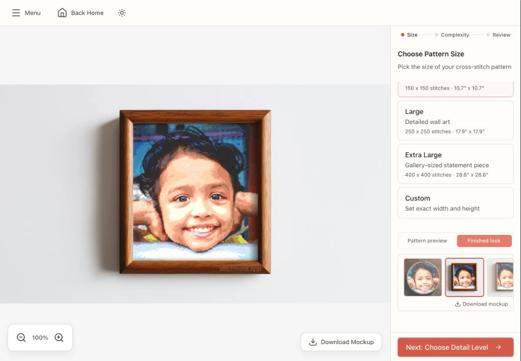
- Finished size of at least 150×150 stitches for recognizable faces
Landscapes and scenery
Landscapes can work beautifully—or produce chaotic patterns. The difference is usually complexity.
What works:
- Simple compositions (mountain against sky, single tree, sunset)
- Strong horizontal or vertical lines
- Limited color variety in large regions
What struggles:
- Dense forests (every tree becomes confetti)
- Detailed cityscapes
- Photos where sky, water, and land all have similar luminosity
Recommended approach: Landscapes often work better as stylized interpretations than photo-realistic conversions. Consider reducing to 12-20 colors and embracing the simplified aesthetic. Gathered regularly publishes landscape and nature patterns that demonstrate how skilled designers simplify complex scenes — worth studying if you're trying to understand what makes a converted landscape work.
Text and logos
Surprisingly, text and logos often convert exceptionally well—if they're large enough.
What works:
- High-contrast text (dark on light or light on dark)
- Bold, simple fonts
- Logos with defined shapes
What struggles:
- Thin or script fonts
- Text smaller than 30 pixels tall in the source image
- Gradients within letters
Tip: For text-heavy designs, consider whether the design might be faster to recreate from scratch in a pattern editor using built-in cross stitch fonts rather than converting from an image.
Pixel art and illustrations
This is where photo conversion shines. Art that's already simplified—pixel art, flat illustrations, clip art—converts almost perfectly.
What works:
- Anything already designed with limited colors
- Video game sprites and fan art
- Simple illustrations with solid fills
These subjects often need minimal adjustment and produce patterns that are genuinely enjoyable to stitch.
What to avoid (and why)
Busy backgrounds
A person standing in a crowd, a flower in a complex garden, a pet on patterned fabric—all of these force the algorithm to spend your color budget on background noise instead of your subject.
Fix: Crop tightly, or edit the background to a solid color before converting.
Photos that are too dark
Dark photos compress into a narrow range of colors that look muddy and lack definition.
Fix: Brighten the image in any photo editor before converting. Increase exposure until you can clearly see details in shadow areas.
Photos that are too small
A 200×200 pixel source image becomes, at best, a 200×200 stitch pattern. But realistically, you'll probably scale it down to something manageable—say, 100×100. Now you have half the detail you started with.
Minimum recommended: At least 500 pixels on the longest edge for patterns you'll stitch at a reasonable size.
Gradients and smooth color transitions
Sky gradients, skin tones, soft lighting—these all create subtle transitions that become stepped, blocky bands in cross stitch.
Fix: This is often unavoidable for realistic subjects. Dithering helps blend transitions, but there's no perfect solution. Accept that some banding will occur, or embrace a more stylized look.
Multiple focal points
A photo of "my dog and cat together by the Christmas tree with the kids" has too many subjects competing for detail. Something will be sacrificed.
Fix: Choose one subject per pattern. Create separate patterns if you want to stitch multiple subjects.
Pre-processing: five minutes that save hours
Before uploading any photo, spend a few minutes in any basic photo editor (even your phone's built-in editor works):
1. Crop aggressively
Remove everything that isn't essential. Your subject should dominate the frame.
2. Boost contrast slightly
Increase contrast by 10-20%. This helps the converter distinguish between similar colors.
3. Simplify or remove the background
If possible, replace a busy background with a solid color. Even a rough selection tool helps.
4. Check the size
Make sure your source image is large enough. If it's under 500 pixels, find a higher resolution version.
5. Consider black and white
For portraits or subjects where color isn't essential, grayscale conversion often produces cleaner patterns with fewer colors needed.
How Stitchmate handles difficult photos
Even with careful photo selection, conversion involves tradeoffs. Stitchmate provides real-time controls that let you find the right balance:
- Live preview updates instantly as you adjust colors, size, and settings—so you can see exactly what you're getting before committing
- Confetti cleanup identifies and removes isolated single stitches that would be tedious to stitch
- Perceptual color matching groups visually similar colors together, reducing unnecessary thread changes
- FLOW score tells you how "stitchable" your pattern is, flagging potential problems before you start
The preview updates in real time as you adjust. Most photos need 30-60 seconds of slider adjustments to find their sweet spot.
Common mistakes to avoid
Mistake 1: Starting with the wrong photo
No amount of adjustment fixes a photo that lacks contrast, has a tiny subject, or contains too much complexity. Choose better source material instead.
Mistake 2: Keeping too many colors
More colors doesn't mean more realistic. It usually means more confetti, more thread management, and a pattern that's harder to stitch. Start with fewer colors than you think you need—you can always add more.
Mistake 3: Making the pattern too large
A 300×300 stitch pattern sounds impressive until you calculate the time: roughly 90,000 stitches, or 200-400 hours of work. Start smaller than you think. 100×100 is substantial; 150×150 is ambitious. Use the fabric calculator to check finished dimensions, and see the time estimation guide for realistic planning.
Mistake 4: Ignoring the preview
The preview exists to show you problems before you commit. If it looks wrong—muddy colors, indistinct subject, scattered confetti—trust what you're seeing. Adjust settings or choose a different photo.
Mistake 5: Expecting perfection
Cross stitch is a grid of colored squares. It will never reproduce photographic detail perfectly. The goal is a pattern that captures the essence of your subject and is enjoyable to stitch. Embrace the medium's aesthetic rather than fighting it.
Ready to test your photo? The photo to cross stitch converter shows a real-time preview so you can see immediately whether your image will work — upload and start converting in one click.
See how your photo converts
The best way to learn is to experiment. Upload a photo and watch the preview update as you adjust settings. In a minute or two, you'll have a feel for what your photo needs—or whether a different photo would work better.
Try Your First ConversionNo account required. The preview shows exactly what you'll get.
FAQ
What resolution should my photo be?
Can I convert a screenshot from my phone?
Why does my portrait look weird?
How do I convert a photo with a transparent background?
Can I use photos I find online?
What if my photo is perfect but still converts poorly?
Should I edit the photo before or after conversion?
Related Guides & Tools
How to Convert a Photo to Cross Stitch
The complete step-by-step tutorial for converting any photo into a stitchable pattern.
What Is Confetti in Cross Stitch?
Learn why scattered stitches happen and how to prevent them in your patterns.
How Many Colors Should a Pattern Have?
Why 15-30 colors is usually the sweet spot and how color count affects confetti.
What Is the FLOW Score?
A 0–100 metric that predicts stitchability (fragmentation, locality, and more).
Collage Composition Guide
Combine your best photos with text, stamps, and borders into a composed design.
Pet Portrait Cross Stitch Tips
Choosing photos, color counts, dealing with backgrounds, and getting eyes right for dog, cat, and memorial portraits.