How Many Colors for a Cross Stitch Pattern? (15–30 Is Ideal)
More colors rarely means a better pattern. Learn why the sweet spot is usually 15-30 colors—and how to avoid the dreaded confetti problem.
Most cross stitch patterns look best with 15–30 colors. Simple graphics need just 5–15, pet portraits work well at 15–25, landscapes suit 20–30, and even detailed human portraits rarely need more than 40. The counterintuitive truth most stitchers take years to learn: more colors rarely means a better pattern.
Beginners assume that a 60-color pattern will look more detailed than a 25-color one. The opposite is usually true. High color counts create scattered, isolated stitches that are miserable to execute and don't actually improve how the finished piece looks from normal viewing distance.
This comes up often in communities like r/CrossStitch and the Cross Stitch Forum: for computer-generated patterns, reducing color count is one of the most reliable ways to cut confetti and make a pattern more enjoyable to stitch.
The sweet spot for most cross stitch patterns is 15–30 colors. But the right number depends on what you're stitching—and understanding why helps you make better choices.
| Pattern Type | Recommended Colors | Example |
|---|---|---|
| Simple graphics & logos | 5–15 | Text, pixel art, icons |
| Pet portraits | 15–25 | Dog, cat, bird |
| Landscapes & nature | 20–30 | Sunset, forest, garden |
| Human portraits | 25–40 | Face, family photo |
| Full-coverage scenes | 30–50 | Detailed panoramas |
Why color count matters
DMC offers 489 embroidery floss colors; Anchor has around 444. With hundreds of shades available, it's tempting to use as many as possible. But every color in your pattern means another skein to buy, another needle to thread, and more starts and stops as you stitch. The thread usage calculator turns your color count into a concrete supply list — meters, skeins, and cost per brand. The real problem with high color counts isn't the inconvenience — it's what happens to your pattern.
The Confetti Problem
When pattern software converts a photo to cross stitch, it tries to match each pixel to the closest thread color. With 60 colors available, the algorithm scatters similar shades throughout your pattern, creating isolated single stitches that don't form coherent shapes.
Stitchers call this "confetti"—and it's one of the most common complaints about computer-generated patterns.
Confetti stitches are:
- Tedious to execute (constant thread changes for single stitches)
- Easy to lose track of (was that one stitch DMC 434 or 435?)
- Visually ineffective (isolated stitches don't register from viewing distance)
Reducing your color count forces the algorithm to consolidate similar shades into larger, stitchable regions. Counterintuitively, this often makes the pattern look better—cleaner color areas that read clearly instead of muddy noise. Stitchmate's FLOW Score quantifies exactly this—measuring how fragmented your pattern is and how much confetti it contains. Want a deep dive? See our guide to confetti in cross stitch — what it is, why it happens, and how to fix it.
Why Most Converters Create Confetti
Here's the technical reality: most free pattern converters use basic algorithms that treat every pixel independently. They ask "what's the closest thread color to this pixel?" without considering what's happening in neighboring pixels.
The result? A mathematically "accurate" conversion that's practically useless for actual stitching. Two nearly-identical brown pixels might get assigned to different thread colors simply because one is 0.5% closer to DMC 434 and the other to DMC 435. Multiply this across thousands of pixels and you get confetti everywhere.
Professional-quality conversion requires smarter algorithms that consider spatial relationships—grouping similar colors into coherent, stitchable regions rather than optimizing each pixel in isolation.
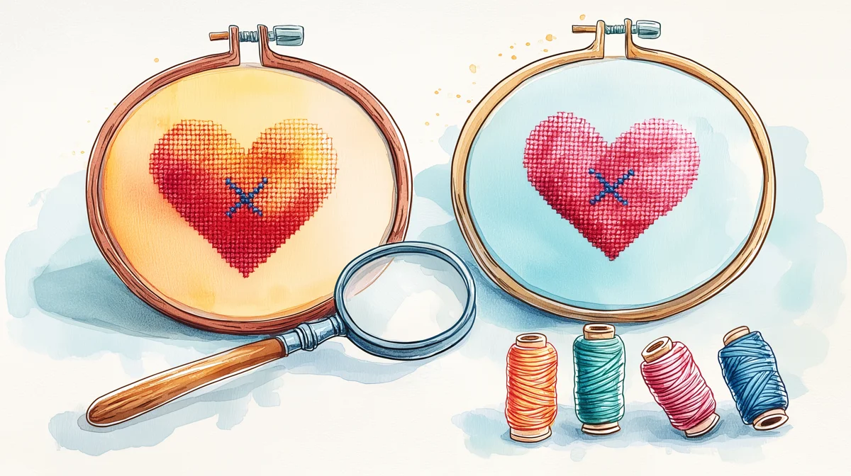
The Viewing Distance Test
Cross stitch isn't viewed under a magnifying glass. Most finished pieces hang on walls, sit on shelves, or get framed and admired from several feet away.
At arm's length and beyond, subtle color distinctions disappear. The difference between DMC 3371 (black brown) and DMC 938 (ultra dark coffee brown) is invisible from across the room—but having both in your pattern doubles your thread changes for zero visual benefit.
When choosing color counts, ask yourself: will anyone actually see this difference in the finished piece?
Recommended color counts by pattern type
Different subjects need different approaches. Here's what works:
Simple Graphics & Logos: 5-15 Colors
Geometric designs, text, simple illustrations, and logos work best with minimal palettes. These patterns rely on clean shapes and clear boundaries—more colors just muddy the design.
A company logo that uses 4 brand colors doesn't need 20 thread colors. Keep it simple.
Pet Portraits: 15-25 Colors
Dog and cat portraits need enough colors to capture fur variation and facial features, but not so many that every hair becomes a separate stitch. Brown dogs might need 4-6 brown shades; the background and eyes add a few more.
The key detail areas—eyes, nose, mouth—benefit from a few dedicated colors. The body and background can consolidate into broader color regions. Our pet portrait guide breaks down color counts by animal type and covers how to handle tricky fur and backgrounds.
Landscape & Nature: 20-30 Colors
Skies, forests, and flowers have natural color gradients that benefit from slightly larger palettes. A sunset might need 5-6 sky colors to avoid obvious banding. Foliage works better with 4-5 greens than with 2.
But more isn't better here. A 40-color landscape won't look twice as good as a 20-color one—it'll just take twice as long.
Human Portraits: 25-40 Colors
Faces are the most demanding subjects. Skin tones need subtle gradation, eyes need precise color placement, and hair requires multiple shades to avoid looking flat.
Even so, 40 colors is usually the practical ceiling. Beyond that, you're adding colors the eye can't distinguish while creating confetti in skin and hair areas.
If your portrait genuinely needs 50+ colors to look right, consider whether the source photo is suitable for cross stitch—or whether a larger pattern size would serve better than more colors.
Full Coverage & Complex Scenes: 30-50 Colors
Large, detailed patterns with multiple subjects, complex backgrounds, and fine detail can justify higher color counts. A 400x500 stitch pattern depicting a detailed garden scene might use 45 colors effectively.
But even here, more isn't automatically better. Many stunning full-coverage pieces use 30-35 colors with careful placement rather than 60+ colors with software-generated confetti.
Already have too many colors in your pattern? Here's how to reduce them effectively — three methods for cutting thread count without visible quality loss.
How Stitchmate handles color reduction differently
Most converters force you to choose: either accept confetti at higher color counts, or lose detail at lower counts. We built Stitchmate's conversion algorithm to break this tradeoff.
Smart Confetti Reduction
Stitchmate's converter uses perceptual color matching that mirrors how you actually see color relationships—not simple RGB distance calculations that treat all color differences equally. When reducing colors, the algorithm considers spatial coherence, grouping similar shades into stitchable regions rather than scattering them as isolated pixels.
The result: cleaner patterns at the same color count, or equivalent detail with fewer colors.
Stitchmate — Clean color regions, vibrant red collar
![]()
Pixel-Stitch — More confetti, yellowish tint

StitchFiddle — Washed out, red collar turns brown
Same photo converted with different tools. Notice how algorithm quality affects color accuracy and confetti—not just color count.
Real-Time Preview
The best way to find your ideal color count is to see it. Stitchmate's converter updates instantly as you adjust the color count slider—no waiting, no "processing" spinners, no guessing.
Watch what happens as you slide from 50 colors down to 25: the confetti consolidates, the color regions become cleaner, and the pattern becomes more stitchable without losing the details that matter. You'll often find a "sweet spot" where the pattern suddenly clicks into place—usually 10-15 colors lower than you expected.
The two-step workflow: convert, then refine
Even with smart algorithms, some confetti may remain in complex areas—and that's okay. The professional approach is a two-step workflow: let the algorithm do the heavy lifting, then manually clean up the stubborn spots.
Step 1: Convert with Optimized Settings
Start in Stitchmate's converter with your color count set to the lower end of the recommended range for your pattern type. Let the algorithm's spatial coherence do its job. For a pet portrait, try 20 colors instead of 30.
Use the real-time preview to find the point where your subject looks good and color regions are clean. Don't worry if a few isolated stitches remain in tricky areas—you'll handle those next.
Step 2: Clean Up in the Editor
Click "Create Pattern" to enter the editor with your converted pattern. Now zoom into any areas that still have confetti—typically high-contrast edges, fine details, or areas where similar colors meet.
The cleanup workflow:
- Zoom in to the problem area
- Eyedrop a surrounding color (click a nearby stitch to select its color)
- Brush over the isolated confetti stitches to replace them with the surrounding color
- Repeat for any remaining scattered stitches
This takes 5-10 minutes for most patterns and transforms a "pretty good" conversion into a polished, professional result. Every edit is undoable, so experiment freely.
Your browser doesn't support video playback.
Cleaning up confetti stitches with the brush tool—select a nearby color and paint over isolated stitches.
Smart algorithms handle the heavy lifting; you clean up the stubborn spots. Five minutes of refinement beats hours of manual placement.
Ready to find your ideal color count?
How to choose the right count for your pattern
Start Lower Than You Think
When converting a photo or creating a new pattern, begin with fewer colors than your instinct suggests. You can always add colors for specific problem areas—but starting high and reducing is harder than building up.
For a first attempt at a pet portrait, try 20 colors in the pattern maker. See how it looks. If specific areas need more definition, add colors selectively rather than globally increasing the count.
Consider Your Timeline
More colors = more time. Not just because of extra thread changes, but because confetti patterns require more concentration and are more prone to errors.
A rough estimate:
| Color Count | Added Complexity |
|---|---|
| Under 15 | Minimal—straightforward stitching |
| 15-25 | Moderate—manageable thread changes |
| 25-35 | Significant—requires organization |
| 35-50 | High—plan for frequent stops |
| 50+ | Intensive—consider if it's worth it |
If you're stitching for relaxation, a 20-color pattern will be far more enjoyable than a 45-color one—even if the latter is theoretically more detailed. Browse the DMC color chart (all 489 colors sampled from official scanned thread cards) to see how rich even a 15-color palette can look when you choose carefully. If you're starting from a photo, the image-to-thread palette tool shows which thread colors your image maps to before you commit to a full conversion.
Check the Color Distribution
A pattern with 30 colors where one color accounts for 60% of stitches (background) is very different from a pattern with 30 colors evenly distributed.
Look at the thread legend. If most colors have only 50-200 stitches each, you might be able to consolidate some without noticeable impact. If several colors each have 1,000+ stitches, they're probably doing meaningful work.
When to break the rules
Large Patterns Can Handle More
A 100x100 pattern has 10,000 stitches. A 250x250 pattern has 62,500 stitches—over six times more. The larger pattern can support more colors because each color covers more area.
The rough ratio: about 1 color per 300-500 stitches of pattern area is sustainable. A 10,000-stitch pattern handles 20-30 colors well. A 60,000-stitch pattern can handle 40-50. Your fabric count determines how those stitches translate to physical size -- the Aida count guide covers how to choose.
Use our fabric calculator to see how pattern size affects finished dimensions and stitching time—then decide if scaling up is worth it for the extra color capacity.
Smooth Gradients Need More Colors
Some subjects—sunsets, skin tones, metallic surfaces—have smooth gradients that band unpleasantly with too few colors. If you see obvious "steps" where gradients should be smooth, adding 2-3 transitional colors can help. Another option is thread blending — combining two similar strands on one needle to create intermediate shades without adding colors to the palette.
Alternatively, subtle dithering can smooth gradients without adding colors—though dithering has its own trade-offs. A pattern with 25 colors and moderate dithering often looks better than 35 colors with no dithering.
Artistic Intent Matters
Some designers deliberately use limited palettes for aesthetic effect. A portrait in 8 colors can be striking in a way a 40-color photorealistic version isn't. Pixel art and retro styles often work better with constraint.
If you're going for a specific look, trust your artistic judgment over general guidelines.
Common mistakes to avoid
Mistake #1: Matching Every Subtle Shade
Your source photo has millions of colors. You don't need to represent all of them. Two shades of gray that differ by 5% brightness can almost always merge into one thread color.
Mistake #2: Adding Colors to "Fix" Confetti
If your pattern has confetti, adding more colors won't help—it'll make it worse. The fix is usually reducing colors and letting a good algorithm consolidate—or using the editor to manually clean up problem areas with the brush tool.
Mistake #3: Trusting the Software's Default
Pattern conversion software often defaults to 40-50 colors because it makes preview images look impressive. But those preview images aren't stitched—you will be. Override the default and choose what's actually stitchable.
Mistake #4: Ignoring Background Colors
A blue sky might use 5 colors for subtle variation—but do you need that variation? Often a single sky color, or at most 2-3, works better than a gradient that creates confetti in the background.
Find Your Ideal Color Count
Upload a photo, adjust the color count slider, and watch your pattern transform in real time.
Try It YourselfNo account required to start.
FAQ
What's the minimum number of colors for a recognizable portrait?
Can I reduce colors in an existing pattern?
Why does my 30-color pattern still have confetti?
Should I count backstitches as separate colors?
Does thread brand affect how many colors I need?
How many DMC embroidery floss colors are there?
Is 50 colors too many for cross stitch?
Related Guides & Tools
How to Convert a Photo to a Cross Stitch Pattern
Learn which photos convert well, optimal settings, and step-by-step conversion guide.
What Is Confetti in Cross Stitch?
Learn what confetti stitches are, why they matter, and how to reduce them in your patterns.
How to Reduce Colors in a Cross Stitch Pattern
Cut thread count without visible quality loss — a practical way to reduce confetti.
DMC vs Anchor Thread
Compare the two biggest thread brands — color range, availability, and quality.
Best Photos for Cross Stitch
Which photos convert well and which don't — avoid starting with the wrong image.
Thread Blending Guide
Create intermediate shades by blending two threads instead of adding more colors to the palette.
What Is the FLOW Score?
How pattern quality is measured — and what makes a pattern enjoyable to stitch.
Data Stitching: Encoding Personal Data in Cross Stitch
Use color as data — map weather, moods, or milestones to a deliberate palette.