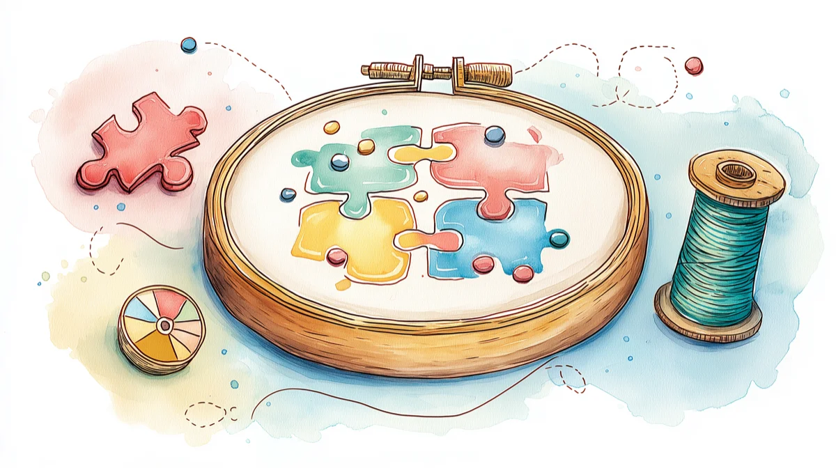
What Is Confetti in Cross Stitch? Why It Ruins Patterns and How to Fix It
That frustrating mess of scattered single stitches ruining your converted photo pattern? It has a name—and it's preventable.
Here's a pattern-making truth that takes most stitchers years to discover: that frustrating mess of scattered single stitches ruining your converted photo pattern? It has a name. Stitchers call it confetti—and it's the number one reason photo-to-pattern conversions feel tedious instead of relaxing.
The good news: confetti isn't inevitable. Once you understand why it happens, you can prevent most of it before you ever thread a needle.
Why confetti matters more than you think
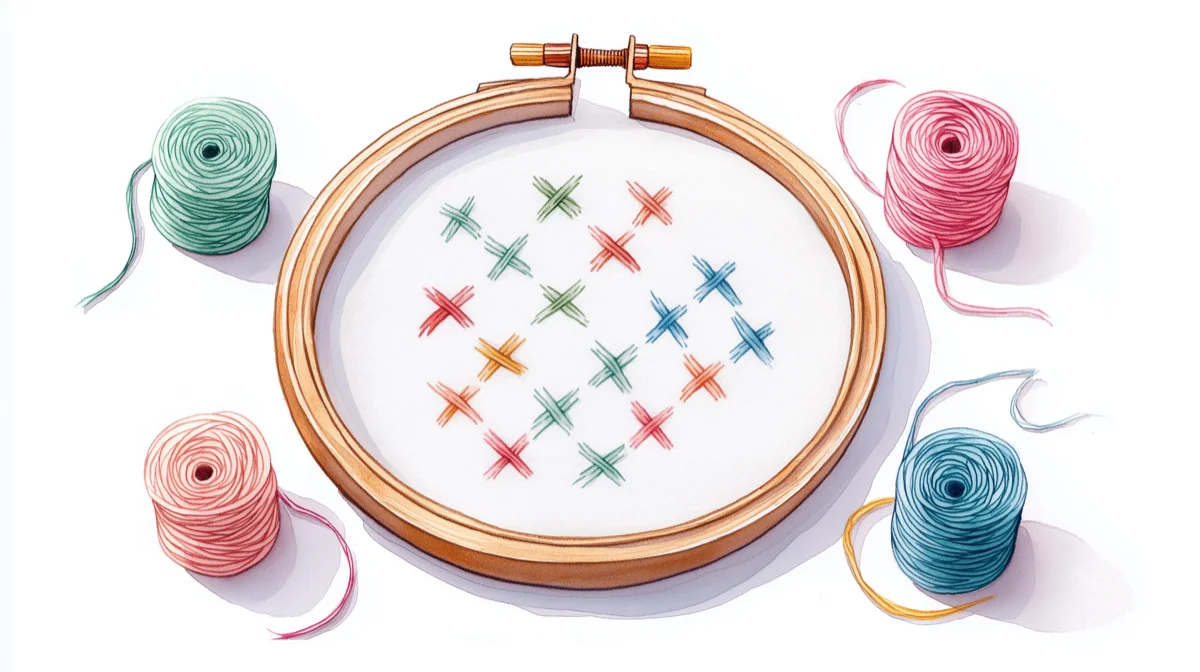
Confetti stitches are isolated single stitches that don't connect to other stitches of the same color. They're scattered across your pattern like sprinkles—hence the name.
A handful of confetti stitches in a 100×100 pattern? Barely noticeable. But when 5-10% of your pattern is confetti, the math gets brutal:
- A 150×150 pattern has 22,500 stitches
- At 5% confetti, that's over 1,100 isolated thread changes
- Each confetti stitch means: end thread, secure, cut, rethread, find the next spot, start again
What should be a meditative 40-hour project becomes a 60-hour exercise in frustration. If you’ve ever stitched a confetti-heavy conversion, you’ve felt this — constant re-threading, chart hunting, and losing your rhythm. It’s a common complaint in communities like r/CrossStitch and the Cross Stitch Forum.
The parking method — leaving threaded needles parked at their next position rather than ending and restarting — is the main technique experienced stitchers use to cope with unavoidable confetti. Peacock & Fig's video tutorial walks through the technique if you'd rather see it in action.
This is why experienced pattern sellers prominently advertise "no confetti" on their Etsy listings. They know what buyers have learned the hard way.
Where confetti comes from
Confetti almost always originates from one of three sources:
1. Photo-to-pattern conversion (the biggest culprit)
Most pattern converters work pixel by pixel. They look at each pixel, find the closest thread color, and move on—never considering what's happening to neighboring pixels.
The result? A photo with subtle color gradients becomes a pattern with dozens of colors scattered everywhere. Your cat's fur, which looks like smooth gray in the photo, becomes a chaotic mix of 15 slightly different grays, each appearing as isolated stitches.
2. Too many colors
More colors sounds better in theory. In practice, more colors means more opportunities for the converter to split similar areas into different threads.
A photo converted with 60 colors will have dramatically more confetti than the same photo converted with 25 colors—even though the 25-color version often looks just as good when stitched. See our guide on how many colors to use for more details.
3. Photos that don't convert well
Some images fight conversion no matter what settings you use:
- Busy backgrounds with lots of small details
- Soft gradients like skies or skin tones
- Low contrast images where colors blend together
- Small details that matter (eyes, text and lettering, fine lines)
A photo of your dog on a clean background converts beautifully. The same dog in a field of wildflowers? Confetti city. If your confetti came from a photo conversion, try reducing the color count first—that alone often eliminates 80% of scattered stitches. Check out our photo conversion guide for tips on choosing the right photos. Before you start stitching, run your dimensions through the fabric calculator to confirm the finished size works for your display.
How to reduce confetti before you stitch
Start with fewer colors
The single most effective confetti reduction technique is limiting colors during conversion. For most photo patterns:
- Simple graphics or logos: 8-15 colors
- Pet portraits: 15-25 colors
- Detailed photos: 20-35 colors
- Complex scenes: 25-40 colors maximum
More than 40 colors rarely improves the final result—it just creates more confetti and more thread management. Learn more about reducing colors effectively.
Choose your photo wisely
Photos that convert cleanly share common traits:
- High contrast between subject and background
- Distinct color areas rather than smooth gradients
- Simple backgrounds (or backgrounds you can crop out)
- Good lighting without harsh shadows
If your original photo is cluttered or low-contrast, consider editing it before conversion. Boosting contrast to 120-140% and simplifying the background often eliminates half the confetti problem before the converter even runs.
Use a converter that considers spatial relationships
Here's the secret most converters miss: colors shouldn't be chosen pixel by pixel. They should be chosen in context.
When a converter considers what's happening to neighboring pixels—grouping similar colors into regions rather than treating each pixel independently—the result is patterns with natural color flow instead of scattered chaos.
This is exactly what Stitchmate's algorithm does. Instead of matching each pixel to the nearest thread color in isolation, it considers spatial coherence—how colors group together to form stitchable regions.
Clean up what remains
Even with the best conversion settings, some confetti may survive. Here's how to handle it:
In the pattern editor: The pattern maker includes a confetti cleanup brush—paint over problem areas and the algorithm replaces scattered stitches with their nearest neighbors. The confetti cleanup tool handbook page covers each cleanup mode and when to use it.
- Zoom in and scan for isolated stitches
- Replace confetti stitches with the most common neighboring color
- Pay special attention to background areas where confetti is most noticeable
When you can't edit the pattern:
- Some stitchers simply skip confetti stitches entirely
- Others substitute the closest color they're already using nearby
- For patterns you're stitching (not selling), perfection isn't required
- Caterpillar Cross Stitch has a thorough guide to anchoring and finishing confetti stitches — covering the loop start problem, pin stitch, and which method works best on each fabric type
How Stitchmate handles confetti differently
Most converters treat confetti as a problem for you to fix later. Stitchmate treats it as a problem to prevent upfront.
The difference is in the algorithm. Where typical converters match colors independently, Stitchmate considers:
- Spatial coherence: Are similar colors grouping into regions you can actually stitch?
- Color distance thresholds: How different do colors need to be to justify a separate thread?
- Isolation detection: Flagging potential confetti before the pattern is finalized
The FLOW Score—Stitchmate's pattern quality metric—specifically measures Fragmentation as one of its four components. A pattern with 2% isolated stitches scores very differently from one with 12%, and you can see this score before you commit to a conversion.
The result: patterns where colors flow naturally into stitchable regions, not scattered fragments.
Ready to see the difference?
Common mistakes that create confetti
Assuming more colors = better results
It's counterintuitive, but limiting colors often produces patterns that look more like the original photo when stitched. Thread has texture and dimension that pixels don't—25 well-chosen colors can capture more nuance than 60 poorly distributed ones.
Converting without previewing
Always preview your conversion before finalizing. If you see salt-and-pepper speckling in areas that should be solid, reduce colors or adjust settings before you commit.
Ignoring the background
Backgrounds cause disproportionate confetti because they often contain subtle gradients (sky, walls, fabric). Consider cropping to the subject, replacing with a solid color, or accepting that background areas will need manual cleanup.
Using the first result
Conversion is iterative. The first settings rarely produce the best result. Adjust color count, contrast, and conversion method, compare previews, and refine until the pattern looks stitchable.
Further reading
- Caterpillar Cross Stitch — Confetti stitches guide for beginners — covers the stitching side of confetti: how to anchor, finish, and manage isolated stitches on different fabric types
- Scarlet Quince — The parking method — the community's most-referenced parking tutorial, essential for stitching confetti-heavy patterns efficiently
- Peacock & Fig — How to park your threads — video walkthrough of parking with honest notes on why it doesn't suit every stitcher
Ready to see the difference?
Upload a photo to Stitchmate's converter and watch the preview update as you adjust colors. The FLOW Score shows you exactly how much confetti to expect before you finalize.
Try It YourselfNo account required to start.
FAQ
Can I fix confetti in a pattern I already bought?
Is some confetti okay?
Why do some designers charge more for "confetti-free" patterns?
Does reducing colors make the pattern look worse?
What's a good confetti percentage to aim for?
Can I just skip confetti stitches?
Does Stitchmate completely eliminate confetti?
Want to check an existing pattern for confetti? Open any PCStitch .pat, Pattern Maker .xsd, or OXS file and toggle the ConfettiScope overlay to see exactly where confetti concentrates.
Related Guides & Tools
How to Reduce Colors in a Cross Stitch Pattern
Cut thread count without losing quality — the fastest way to reduce confetti.
How Many Colors for Cross Stitch?
Find the right color count for your pattern type—the first step to avoiding confetti.
How to Convert a Photo to Cross Stitch
Choose better photos and conversion settings to avoid confetti up front.
What is the FLOW Score?
Learn how fragmentation is measured and what makes a pattern actually stitchable.
Thread Blending Guide
Bridge color gaps with blended threads instead of adding transition colors that create confetti.
How to Fix Cross Stitch Mistakes
When confetti causes miscounts and color errors — frogging, unpicking, and when to just leave it.