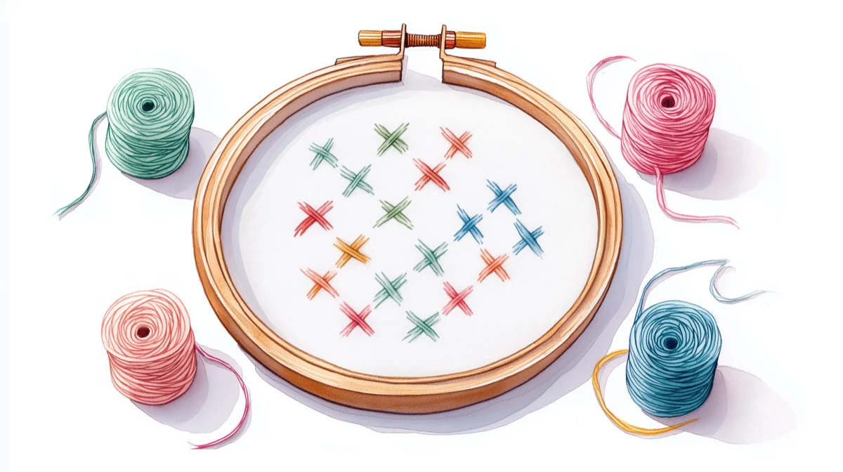
How to Reduce Colors in a Cross Stitch Pattern (3 Methods)
You don't need all 47 colors from your photo conversion. Learn which colors to cut, which to keep, and how to simplify patterns without losing quality.
To reduce colors in a cross stitch pattern, remove three types: orphan colors (under 1% of stitches), near-duplicate shades, and unnecessary transition colors. For most photo conversions, 20-30 colors is the sweet spot — enough for realistic detail, few enough to actually finish.
You converted a photo, and now you're staring at a pattern with 47 thread colors. That's 47 skeins to buy, 47 needles to thread, and 47 opportunities to grab the wrong color at 11pm. The good news: most of those extra colors appear in fewer than 20 stitches — your eyes won't register them in the finished piece. Here's how to cut the excess without losing what matters.
Not sure what your target color count should be? See the color count guide by pattern type →
Why fewer colors often means a better pattern
More colors doesn't equal more detail. It equals more thread changes, more concentration, and more mistakes.
Consider what actually happens when you stitch a 45-color pattern versus a 20-color version of the same image:
| 45 colors | 20 colors | |
|---|---|---|
| Thread changes | Every few stitches | Longer continuous runs |
| Cost (DMC) | ~$135 in thread | ~$60 in thread |
| Estimated time impact | Frequent thread changes slow you down | Longer runs = 15-20% faster stitching |
| Concentration required | Exhausting | Manageable |
| Visible difference at arm's length | Minimal | Minimal |
That last row is the key insight. Human eyes blend adjacent colors naturally. Two similar greens that require separate skeins will merge into one "green area" when you step back from the finished piece. The question isn't whether you can use 45 colors—it's whether those extra 25 are doing anything you'll actually notice.
The three types of colors you can safely remove
1. Orphan colors (fewer than 1% of stitches)
These are colors that appear in 10, 20, maybe 50 stitches across your entire pattern. They're usually artifacts of the conversion algorithm trying to match every subtle shade in your source photo.
The test: If a color represents less than 1% of your total stitch count, it's a candidate for removal. A 150×150 pattern (22,500 stitches) shouldn't need a color that appears only 30 times.
What to do: Merge these into the nearest similar color. DMC 3371 (black brown) with 28 stitches? Merge it into DMC 310 (black) or DMC 898 (dark coffee brown), whichever dominates nearby.
2. Near-duplicate colors
Photo converters often select multiple threads that are nearly identical. You might end up with DMC 414, 317, and 413—three medium grays that look almost the same on fabric.
The test: Put the thread swatches side by side. If you'd struggle to tell them apart without labels, your finished stitching won't show the difference either.
What to do: Keep the one used most frequently. Merge the others into it. You'll eliminate thread changes without visible quality loss.
Note: If you're working with both DMC and Anchor threads, be aware that their "equivalent" colors aren't always identical. See our DMC vs Anchor comparison before mixing brands. Thread-Bare has stitched comparison samples of five thread brands side by side — useful for seeing how "equivalent" colors actually look on fabric before you commit to merging.
3. Transition colors you don't need
Some converters add intermediate shades to smooth color gradients—light pink between red and white, for example. These make sense for realistic portraits where skin tone matters. They're unnecessary for bold graphics or designs where clean color boundaries work better.
The test: Does the pattern look better with soft transitions, or would crisp boundaries suit the subject? A geometric owl doesn't need seven shades of orange blending into each other.
What to do: For graphic or illustrative subjects, remove transition colors and let the main colors sit adjacent. The natural color blending that happens in cross stitch fabric will soften edges anyway.
How many colors do you actually need?
The right number depends on your subject and your patience. Here's what typically works:
| Subject type | Recommended colors | Why |
|---|---|---|
| Simple graphics, logos, text | 5–12 | Clean boundaries, bold impact |
| Landscapes, nature scenes | 15–25 | Need enough greens/blues for depth |
| Pet portraits | 15–25 | Fur texture needs some variation |
| Human portraits | 25–40 | Skin tones require more subtlety |
| Photo-realistic large pieces | 40–60 | Only if detail is the explicit goal |
The honest tradeoff: Below 15 colors, most photo conversions start looking posterized—like a pop art effect rather than a realistic image. That's not bad if it's the look you want. It is bad if you're expecting a faithful portrait of grandma.
For most stitchers converting personal photos, 20-30 colors hits the sweet spot — a range that comes up repeatedly in discussions on r/CrossStitch and pattern designer forums. It's enough fidelity to recognize faces and capture mood, few enough to actually finish without losing your mind.
A real example: pet portrait from 42 to 18 colors
A typical cat photo converted at 150×200 stitches might produce 42 colors. Here's what usually happens when you audit the palette:
- 8 orphan colors — each with fewer than 50 stitches. These include near-whites in whisker highlights and micro-shades of brown that only appeared in 2-3 pixels of the source photo. Merge into the nearest dominant shade.
- 6 near-duplicates — three pairs of browns, grays, and tans that are virtually indistinguishable on fabric. Keep one from each pair.
- 4 transitions — mid-tone blends between the background and the cat's fur that aren't needed because the fur edge looks fine with a clean boundary.
- 6 remaining cuts — less-used accent colors that can merge into neighbors without visible loss.
Result: 18 colors. The cat is still recognizable. The fur still has depth. But the project now needs 18 skeins instead of 42, and you'll have longer continuous stitching runs — which means it's faster and more enjoyable.
Step-by-step: Reducing colors after conversion
Method 1: Remove colors by usage count
Start with the colors that appear least often:
- Sort your palette by stitch count (fewest first)
- Look at colors representing less than 1% of stitches
- For each, find the most similar color that appears more frequently
- Merge the small color into the larger one
- Repeat until you've hit your target color count
This method is systematic and hard to mess up. You're removing colors that contribute least to the overall image.
Method 2: Remove by visual similarity
If your palette has clusters of similar shades:
- Group colors that look alike (three similar blues, four similar browns)
- Within each group, keep only the lightest and darkest
- Merge middle shades into whichever neighbor is closer
- Review the pattern—if gradients look too harsh, restore one middle shade
This method is faster but requires better color judgment. It works well when your palette has obvious redundancy.
Method 3: Target a specific color count
When you know exactly how many colors you want:
- Set your target (say, 20 colors)
- Use automatic color reduction to get close
- Review the result for problem areas
- Manually adjust any colors that merged badly
The automatic reduction won't always choose the same mergers you would. Faces are the most common problem—check that skin tones didn't merge into something unnatural.
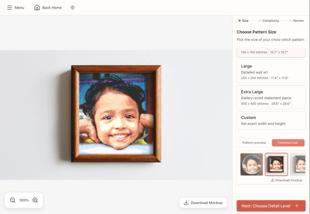
How Stitchmate handles color reduction
Stitchmate's color palette panel shows every thread in your pattern, sorted by stitch count. You can see immediately which colors dominate and which are barely used. The palette tools handbook walks through each feature in detail.
To reduce colors:
- Open your pattern in the editor
- Click any color in the palette to select it
- Choose "Replace with..." to merge it into another color
- The pattern updates instantly—you'll see the effect before committing
For bulk reduction, use the "Reduce colors" option in the palette menu. Set your target count, and Stitchmate merges the least-used, most-similar colors automatically. You can undo the whole operation if it doesn't look right, or undo individual color merges to restore specific threads.
The algorithm prioritizes keeping colors that anchor the design—the distinctive shade in an eye, the highlight that gives shape to a face. Orphan pixels in backgrounds go first.
Want a concrete measure of whether you've reduced enough? Check the FLOW Score—it measures fragmentation, color clustering, and overall stitchability. A higher score means you've created cleaner color regions that will be more enjoyable to stitch. When remapping colors, the DMC color card remains the most reliable reference for judging thread colors — screens can mislead, especially in the mid-tone browns and grays where near-duplicates cluster. The DMC color chart helps find the closest alternatives. For patterns using Anchor threads, the brand conversion tool helps find equivalents.
Ready to simplify your pattern?
Color reduction and confetti: how they're connected
Reducing colors naturally reduces confetti — those scattered single stitches that make patterns frustrating. When you merge a rarely-used color into a more common one, its isolated stitches join larger color regions. If your pattern has a confetti problem, color reduction is often the first fix to try.
The order matters: clean up obvious confetti first (stray single stitches surrounded by a different color), then reduce colors. This ensures your stitch counts are accurate before you decide which colors to merge.
→ What confetti is and how it ruins patterns
Common mistakes when reducing colors
Cutting too aggressively at once
Removing 30 colors in one pass makes it hard to see what went wrong if the result looks bad. Instead, reduce in stages: go from 45 to 30, evaluate, then 30 to 20. You'll catch problems earlier.
Ignoring color relationships
Two colors might both be used rarely, but one is the only warm tone in a cool-toned area. Remove it, and that area goes flat. Pay attention to where colors appear, not just how often.
Trusting the algorithm completely
Automatic reduction is a starting point, not a final answer. Always review faces, focal points, and areas where color contrast matters. A human eye catches problems that math misses.
Merging across temperature boundaries
Merging a warm gray into a cool gray (or vice versa) is more visible than merging two warm grays of different values. When choosing merge targets, match temperature first, then brightness.
See it in action
Upload a photo and try the color slider yourself. Watch how the pattern changes as you move from 50 colors down to 15.
Convert a PhotoNo account required to start.
FAQ
Will reducing colors make my cross stitch pattern look worse?
How do I know if I've cut too many colors?
Should I reduce colors before or after cleaning up confetti?
Can I reduce colors during the initial conversion instead of after?
What if I reduce colors and then change my mind?
Is there a minimum number of colors for a good cross stitch pattern?
What's the best way to reduce colors in cross stitch software?
Related Guides & Tools
How to Convert a Photo to Cross Stitch
Step-by-step guide to converting photos into stitchable patterns you'll love.
How Many Colors for Cross Stitch?
Find the right color count for your pattern type and avoid common mistakes.
Best Photos for Cross Stitch
Choose photos that convert well—and avoid the ones that don't.
What is Confetti in Cross Stitch?
Understand confetti stitches and learn when to clean them up.