Cross stitch fonts — how to choose the right alphabet for your project
The font you pick determines whether your text reads clearly from across the room or dissolves into a mess of scattered stitches at arm's length.
The font you pick determines whether your text reads clearly from across the room or dissolves into a mess of scattered stitches at arm's length. Most stitchers pick a font, stitch the whole phrase, and only then realize it doesn't work at the size they chose — or on the fabric count they're using.
Stitchmate includes 48 built-in cross stitch fonts — click any font below to see its full character set rendered on a stitch grid, or type your own text to preview it.
Want to skip straight to designing? The cross stitch text generator turns any text into a stitchable chart — pick a font, add a border, and download the pattern or open it in the editor.
This guide is about choosing a font. For the stitching side — working a single letter, centering a name, signing a finished piece — see how to cross stitch letters, names, and signatures. Working on canvas rather than Aida? The needlepoint fonts and lettering guide covers mesh count, monograms, and tent-stitch alphabets.
Below, we'll break down the two main types of fonts, how to pick the right one for your project, and how font size translates to finished dimensions on different fabric counts.
Two types of cross stitch fonts
Not all cross stitch letters are built the same way. Some fill entire grid squares, others trace thin outlines between them. The type you choose affects how your text looks, how long it takes to stitch, and how large it needs to be to stay legible.
Full-stitch fonts
Full-stitch fonts are what most stitchers picture when they think of cross stitch letters — each character is a pattern of filled grid squares. Every cell in the letter becomes a full cross stitch.
Stitchmate includes 36 full-stitch fonts ranging from compact 3×5 characters (just 15 stitches per letter) to bold display typefaces like Helvetica Bold and Times at 9–12 stitches tall. The full list includes classic styles (Courier, Helvetica, Times, Utopia), compact utility fonts (3×5, 5×7, 5×8, 6×9), and character sets with personality (ECA, UCF Fan).
Best for: traditional samplers, bold statement text, patterns where the lettering should match the weight of the surrounding cross stitch design. The compact variants (3×5, 5×7) are also the go-to choice for dates, initials, and small labels where space is tight.
Tradeoff: full-stitch fonts use more thread and take longer to stitch than backstitch fonts at the same visual size. The compact variants are very efficient but sacrifice curves — letters like S, G, and R can look angular at small sizes.
Backstitch fonts
Most stitchers think of backstitch as an outlining technique, but it also makes beautiful lettering. Backstitch fonts render letters as thin lines that follow the grid intersections — the same technique used for pattern outlines, applied to typography.
The result is elegant, flowing lettering that looks closer to handwriting or calligraphy than traditional cross stitch text. Because each stroke is a single line rather than a filled square, backstitch letters use significantly less thread and stitch faster.
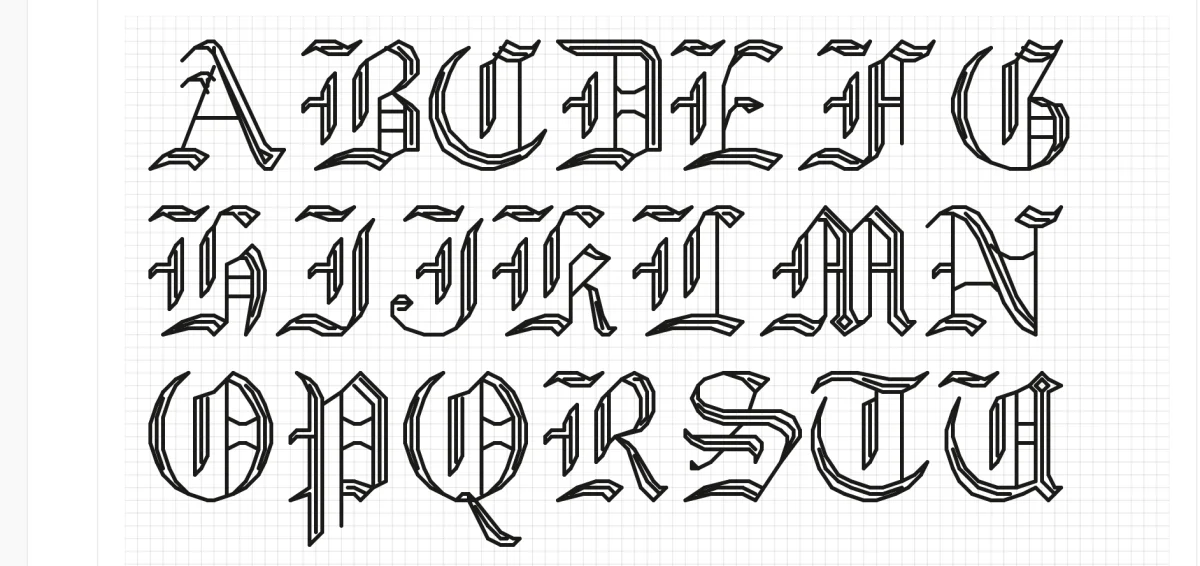
Stitchmate includes 12 backstitch fonts from the Hershey typeface family — a set of letterforms originally created for plotters in the 1960s, now adapted for cross stitch grids. The collection covers Sans, Sans Bold, Serif (in regular, bold, italic, and bold italic), Script, Script Bold, Cursive, and three Gothic styles (English, German, Italian).
Each backstitch font can be scaled continuously from 4 to 30 stitches tall using a slider, so you can fine-tune the height to exactly match your layout.
Best for: wedding samplers, quotes, elegant monograms, adding signatures or dedications, any project where you want text that feels handwritten or calligraphic rather than blocky.
Tradeoff: backstitch lettering is thinner and lower-contrast than full-stitch fonts. On busy or highly colored backgrounds, backstitch text can get lost — it works best on clean, open areas of your pattern. Backstitch is also slightly harder to stitch than full crosses for absolute beginners, since the needle follows grid lines rather than filling squares. See the backstitch guide for technique details.
Use any font on your device
None of the 48 built-in fonts quite right? Stitchmate can also convert any font installed on your device — Helvetica, Georgia, Garamond, Impact, whatever matches your project — directly onto the stitch grid.
The text tool renders your chosen font at any height from 4 to 30 stitches, mapping the result to the nearest grid squares. The quality depends on size: at 15+ stitches tall, most fonts produce clean, recognizable letterforms. Below 10 stitches, curves get jagged and thin strokes may disappear — this is where the purpose-built full-stitch and backstitch fonts outperform device fonts.
You may also see scattered single stitches (confetti) around letterforms at intermediate sizes. The confetti cleanup brush can help smooth these out.
This is useful for matching a specific typeface — a brand logo, a wedding invitation font, a favorite book cover — or for display text at large sizes where you want a particular personality that the built-in fonts don't cover.
How to choose a font for your project
The right font depends less on personal taste and more on three practical factors: what the text needs to say, how large it will be when stitched, and what's around it in the pattern.
Baby samplers
You typically need two fonts: a larger one for the name (7–12 stitches tall) and a compact one for the birth date, weight, and time (3–5 stitches tall). Full-stitch fonts like Clear 6x10 or Helvetica work well for the name. For the data line, 3×5 or 5×7 keep things tight without sacrificing readability.
Wedding and anniversary pieces
Script and cursive backstitch fonts set the tone. Serif Italic and Script Bold from the backstitch collection give you flowing, elegant lettering that feels appropriate for formal occasions. Set the couple's names at 15–20 stitches tall, the date at 8–12 stitches. Backstitch text on a clean linen or evenweave background looks particularly refined.
Subversive cross stitch and quote pieces
The contrast between an elegant font and irreverent words is the whole point. The genre was largely popularised by Subversive Cross Stitch — Julie Jackson's book and pattern line that put profanity in sampler borders. Use a backstitch Cursive or Gothic English font for the cheeky message — the more refined the letterforms, the funnier the contrast. A thread color in deep burgundy or navy on a light background sells the "grandmother's sampler" look. Peacock & Fig has a practical tutorial on adapting cross stitch alphabets to fit custom phrases — useful if you're combining built-in fonts with your own layout.
Kitchen signs and home décor
"But First, Coffee" and "Home Sweet Home" need to read from 2–3 meters. Use Helvetica Bold or Sans Bold full-stitch fonts at 10+ stitches tall. Bold full-stitch letters have the highest contrast and remain legible even if the piece hangs in a spot with mixed lighting.
Labels, dates, and initials on larger pieces
Compact full-stitch fonts (3×5, 5×7) at 1x scale. The text shouldn't compete with the main design — it's metadata, not the headline. One or two colors maximum, usually in a neutral tone that complements the palette. For free downloadable alphabet charts you can print and stitch from directly, Lord Libidan's collection of 50+ cross stitch alphabets covers sizes from 3 stitches tall to full display fonts.
Monograms
Single letters can afford to be large — 15–25 stitches tall — and highly decorative. Backstitch Serif Bold Italic or Gothic English make striking monograms. For framed initials or personalized gifts, try the letter at multiple sizes on the preview grid before committing.
Font size, fabric count, and finished dimensions
The same 7-stitch-tall font produces very different physical sizes depending on your fabric count. Before you stitch, calculate how large your text will actually be.
| Font height (stitches) | 11-count Aida | 14-count Aida | 16-count Aida | 18-count Aida |
|---|---|---|---|---|
| 7 stitches | 16 mm (0.64") | 13 mm (0.50") | 11 mm (0.44") | 10 mm (0.39") |
| 15 stitches | 35 mm (1.36") | 27 mm (1.07") | 24 mm (0.94") | 21 mm (0.83") |
A 7-stitch-tall font on 14-count Aida produces letters about half an inch (13 mm) high — comfortable reading distance for a framed piece. The same font on 18-count shrinks to 10 mm — still legible up close, but it might disappear on a large wall piece. For the full height-by-count table and minimum legible sizes, see how to cross stitch letters and names. Use the fabric calculator to find your exact finished dimensions before cutting fabric, and see what is Aida count for help choosing a fabric count.
Tips for better cross stitch lettering
Spacing matters more than font choice. One empty column between letters and two between words is the standard starting point — but test it in the editor first. Tight spacing makes text feel cramped and hard to read; too loose and the letters disconnect from each other. Two Little Kits has a thoughtful guide on typography principles applied to cross stitch — covering x-height, serif vs sans-serif, and how font weight affects readability on the grid.
Backstitch outlines sharpen small full-stitch text. Adding a single backstitch outline around each character — especially in compact fonts like 3×5 or 5×7 — adds definition without adding bulk. Some stitchers add outlines in a slightly darker shade of the same color family.
Center your text before you stitch. Count the total width in stitches, find the center of your fabric, and work outward. Off-center text is the single most common mistake in sampler stitching, and it's unfixable without ripping. Stitchmate's text tool centers multi-line text automatically.
Color contrast is not optional. Dark thread on light fabric, or light thread on dark fabric. Mid-tone thread on mid-tone fabric vanishes — no matter how good the font is. If your text disappears in the pattern preview, increase the contrast before you stitch.
Test at actual viewing distance. Hold your screen at the distance the finished piece will hang. If you can't read the text in the preview, go up a font size or drop down an Aida count. This five-second test saves hours of stitching and ripping.
Mix font types for visual hierarchy. The best samplers use two or three fonts at different sizes — a backstitch script for the main quote, a full-stitch font for the name, and a compact 3×5 for the date. Keep it to two or three styles; more than that gets chaotic.
Free cross stitch fonts
"Free cross stitch fonts" means three different things depending on who's searching, and it's worth separating them.
Free alphabet charts to print. Designers give these away as a fixed chart — one style, one size, every character laid out on a grid for you to copy stitch by stitch. Lord Libidan's collection is the largest single source, and most pattern shops publish a sampler alphabet or two. The limitation is the fixed size: if the chart is 7 stitches tall and you need 10, you're redrawing it yourself.
Free fonts inside a pattern editor. All 48 fonts built into Stitchmate — the 36 full-stitch alphabets and the 12 backstitch scripts — are free to preview and free to use, at any size and in any color, in the editor and the text generator. No account is needed. Downloading a print-ready PDF is the paid step — the same unlock as the rest of Stitchmate — while previewing, designing, and charting your text are free. The difference from a printed chart is that the font is rendered for your exact phrase, spacing and centering included, rather than assembled letter by letter.
Free typefaces converted to stitches. The text tool also renders 34 curated Google Fonts — 10 of them script and handwriting faces — plus any font installed on your device. A free script from that Google Fonts set, a display face from your own collection, the typeface on a wedding invitation — each becomes a cross stitch alphabet the moment you type in it. Quality depends on size, as covered above: 15 stitches and taller is where device fonts look their best.
Looking for a free cursive cross stitch font specifically? The backstitch Script, Script Bold, and Cursive fonts in the library are the closest thing to handwriting that still follows the grid cleanly, and they scale from 8 to 30 stitches tall. For a heavier, more calligraphic cursive at 15+ stitches, one of the text tool's 10 script Google Fonts rendered as full stitches works well.
Stitchmate's font library
Stitchmate includes 48 built-in fonts across two categories — full-stitch and backstitch — plus the ability to use any font installed on your device. Every font is free to preview and use in the editor.
The text tool handles multi-line text with automatic centering, supports full cross stitches and backstitch rendering, and lets you adjust font size with either a scale multiplier (full-stitch fonts) or a continuous height slider (backstitch and device fonts). Type your text, pick a font, adjust the size, and see the result on the grid in real time.
What font is best for cross stitch beginners?
How do I add text to a cross stitch pattern?
Can I use any computer font for cross stitch?
How many stitches tall should cross stitch letters be?
What is the difference between cross stitch fonts and alphabet patterns?
What is a backstitch font?
Where can I find free cross stitch alphabet patterns?
Are there free cross stitch fonts?
Is there a free cursive cross stitch font?
Turn your text into a pattern
Type your text, pick a font, adjust the size — see the result rendered as real stitches, then download the chart or refine it in the editor.
Open the text generatorFree to use. No account required.
Related Guides & Tools

What is Aida count?
How fabric count affects finished size and detail level — the key factor in choosing font size.
What is confetti in cross stitch?
Why scattered stitches appear around device font text and how to clean them up.
Backstitch in cross stitch
The technique behind backstitch fonts — when and how to use outline stitches.

How to convert a photo to a pattern
Turn photos into stitchable charts — then add text with any of the built-in fonts.
Collage composition for cross stitch
How to arrange text, motifs, photos, and borders into a cohesive sampler-style design.
Design a pattern from scratch
Size and count first, sketch in blocks of 10, borders, then letter last — the order that keeps text from pushing everything around.
How to cross stitch letters, names, and signatures
The stitching side of lettering — working a single letter, centering a name, and signing your work.
Needlepoint fonts and lettering
Tent-stitch alphabets, monograms, and letter height by mesh count for canvas work.