Designing Cross Stitch Patterns as Collage: Composition Guide
Instead of designing a pattern as a single image, design it as a composition — an arrangement of separate elements that work together. Here's how to think about layout, balance, and rhythm on the grid.
Quick answer: Instead of designing a cross stitch pattern from a single image, compose it from separate elements — stamps, text, photos, borders — arranged like a collage. It's faster, more forgiving, and produces patterns that feel curated and personal.
Most cross stitch patterns start from a single image — a photo you've converted, a chart you've purchased, a design drawn stitch by stitch. One source, one output.
But there's another way to work. Instead of designing a pattern as a picture, design it as a composition — an arrangement of separate elements that work together. A motif here, a text block there, a border framing the whole thing, a converted photo anchoring the center, small stamps scattered to fill negative space.
This is how graphic designers, collage artists, and zine makers think. It's also how traditional sampler makers thought — centuries before Photoshop, they were composing pieces from reusable motifs, alphabets, borders, and decorative fills. They just didn't call it collage.
Stitchmate's stamp library, text tool, and layers make this kind of modular composition possible on a grid. Here's how to think about it.
The shift: from drawing to arranging
When you draw a pattern stitch by stitch, you're thinking like a painter — building an image from individual marks. When you compose a pattern from elements, you're thinking like a designer — making decisions about placement, proportion, hierarchy, and balance.
Neither approach is better. They produce different kinds of work. But composition-based design has some practical advantages:
- It's faster. Placing and rearranging pre-made elements takes minutes, not hours.
- It's more forgiving. Don't like the arrangement? Move things around. Swap a motif. Try a different border. Nothing is permanent until you decide it is.
- It produces patterns that feel curated. A well-composed collection of elements has a different quality than a single image — looser, more personal, more alive.
- It's repeatable. Once you've built a library of elements you like, you can remix them into new patterns endlessly. Same stamps, different arrangements, different palettes.
Five principles of grid composition
Cross stitch design happens on a grid with discrete colors — which actually makes composition easier than in free-form media, because everything aligns naturally. Here are the principles that make the difference between a layout that feels considered and one that feels scattered.
1. Create a focal point
Every composition needs something that draws the eye first. Without it, the viewer's gaze wanders and the piece feels aimless.
On a cross stitch grid, your focal point might be:
- A converted photo (a pet portrait, a landscape detail, a face)
- A large motif (a bouquet, a house, an animal)
- A text block (a quote, a name, a date)
- The largest or most colorful element in the design
The focal point doesn't have to be centerd — off-center placement often feels more dynamic. But it should be the most visually "heavy" element: the biggest, the most detailed, or the most colorful. Everything else supports it.
2. Balance weight, not symmetry
Symmetrical designs are safe and satisfying. Asymmetrical designs are more interesting. The key is that asymmetry still needs to feel balanced — like a seesaw with different-sized objects on each side.
Visual weight on a cross stitch grid comes from:
- Size. Larger elements are heavier.
- Color saturation. Bold, dark colors are heavier than pastels.
- Detail density. Areas with lots of color changes feel heavier than solid blocks.
- Position. Elements near the edges feel heavier than elements near the center (they pull the eye outward).
A large motif on the left can be balanced by several small stamps on the right. A dark cluster at the bottom can be balanced by a lighter, wider element at the top. The goal isn't mathematical equality — it's the feeling of stability.
3. Use negative space deliberately
Negative space — the unstitched area of fabric — isn't empty. It's a design element. It gives the eye places to rest, separates elements so they can be read individually, and lets the fabric color contribute to the overall palette.
Common mistakes with negative space:
- Too little. Elements crammed together with no breathing room feel cluttered and are harder to stitch (constant color changes at boundaries create confetti).
- Too much in the wrong places. Large empty areas at the edges, with everything pushed to the center, feel timid.
- Inconsistent spacing. Some gaps tight, others loose, with no pattern to the variation. It reads as careless rather than intentional.
A useful rule of thumb: leave at least 3–5 stitches of space between separate elements. For elements that belong together (a motif with its label, for example), tighter spacing signals the relationship. For elements that are distinct, wider spacing reinforces the separation.
4. Create rhythm through repetition
Repetition is the difference between a collection and a composition. When an element appears more than once — a small heart stamp, a color accent, a border motif — it creates visual rhythm that ties the whole piece together.
Ways to create rhythm on the grid:
- Repeat a small stamp at regular or irregular intervals across the design.
- Use the same color in multiple unrelated elements — a red in the border, a red in the central motif, a red in the text.
- Echo a shape. If your main motif has curves, use a border with curves. If it's angular, use geometric accents.
- Repeat at different scales. A large flower as the focal point, smaller flowers as accents, tiny flower stamps as fills.
5. Establish hierarchy with scale contrast
Hierarchy tells the viewer what to look at first, second, third. The simplest way to create hierarchy is through scale contrast — the difference in size between your largest and smallest elements.
A design where everything is roughly the same size feels flat. A design with one large element, several medium elements, and many small accents feels structured and readable, even from across the room.
Traditional samplers use exactly this hierarchy:
- Large: A central scene or verse (the focal point)
- Medium: Alphabets, secondary motifs, borders
- Small: Corner decorations, dividing lines, scattered accents
- Tiny: Backstitch details, individual symbols, date text
Practical workflows in Stitchmate
The stamp-first approach
Start with the stamp library. Browse through the available motifs and collect a handful that share a theme, a color palette, or a feeling. Don't plan the whole layout yet — just gather elements that appeal to you.
Then open a new pattern at your target size and start placing stamps. Move them around. Try different arrangements. Add text. Add a border. Remove things. This is the digital equivalent of arranging cut paper on a table before gluing anything down.
The beauty of working digitally is that nothing is permanent. You can try ten arrangements in the time it would take to stitch one. When something clicks — when the balance feels right and the eye moves naturally through the composition — save it and start stitching.
The photo-plus-elements approach
Start with a converted photo as your anchor — a pet, a landscape, a favorite image. Import it at a size that leaves room around it for additional elements.
Then build outward: add text below or above (a pet's name, a date, a short phrase). Add a border to frame the composition. Scatter small stamps in the corners or margins. The photo provides the emotional center; the surrounding elements provide context and polish.
This approach works particularly well for gifts. A pet portrait becomes a memorial piece when you add a name, dates, and small paw-print stamps. A landscape becomes a travel memento when you add the place name and coordinate stamps.
The band sampler approach
This is the most traditional composition method, and it's still one of the best. Divide your canvas into horizontal bands (rows), and fill each band with a different element:
- Band 1: A decorative border
- Band 2: An alphabet or a name
- Band 3: A row of motifs (animals, flowers, objects)
- Band 4: A verse or quote
- Band 5: A larger scene or focal motif
- Band 6: A date and initials
- Band 7: A closing border
The bands don't have to be the same height — in fact, they shouldn't be. Varying the band heights creates visual interest and avoids monotony. Aim for one band that's noticeably taller than the others (your focal element) and let the rest support it at varying shorter heights.
Use a dividing motif between bands — a thin horizontal line, a row of small repeated stamps, or a simple geometric border. These dividers separate the bands visually while tying them together as parts of one piece.
The scattered/organic approach
For something less structured: place your focal element off-center, then arrange smaller elements around it in a loose, organic cluster. Think of how wildflowers grow — not in rows, but in natural-looking groups with varying density.
This works especially well for:
- Botanical compositions (a large flower surrounded by smaller blooms and leaves)
- Seasonal collections (scattered holiday motifs without a rigid grid)
- Abstract arrangements (geometric stamps at different scales and rotations)
The key is to cluster elements rather than distributing them evenly. Clusters create visual "gravity" — areas where the eye lands and explores. Even spacing feels mechanical; clustered spacing feels natural.
Building your element library
The more elements you have to work with, the more compositions you can create. Think of building a personal library of reusable pieces:
Motifs and stamps. Browse Stitchmate's built-in stamp collection. Save your favorites. Over time, you'll develop a personal "kit" of elements that reflect your style — the way a graphic designer develops a folder of icons and textures.
Borders. Collect border patterns at different widths. A 2-stitch simple line. A 4-stitch geometric repeat. An 8-stitch elaborate vine. Having borders at multiple scales lets you match the border weight to the composition size.
Text styles. Stitchmate includes 48 cross stitch fonts. Experiment with different sizes for different roles — a large decorative font for names, a small clean font for dates, a script font for quotes.
Converted image fragments. Not every photo conversion needs to be a complete image. Convert a small detail — a single flower from a garden photo, an eye from a portrait, a cloud from a landscape — and use it as one element in a larger composition.
Your own designs. Draw small motifs in the editor and save them. A heart. A star. Your initials in a specific style. These become your personal "handwriting" — elements that make your compositions recognizably yours.
Learning from traditional samplers
Sampler makers have been composing from modular elements for over 400 years, and their instincts are worth studying. The Victoria and Albert Museum's embroidery collection has outstanding examples spanning every era.
The earliest samplers (1500s–1600s) were "spot samplers" — random arrangements of motifs on fabric, with no particular order. They were reference libraries, not display pieces. The composition was informal, even chaotic. There's a lesson here: not everything needs to be perfectly arranged. Sometimes a loose collection of things you like is enough.
Band samplers (1600s–1700s) introduced structure — horizontal rows of motifs, alphabets, and decorative borders. This is the template most people think of as a "sampler." The structure makes composition easier because each band is its own mini-design problem. Fill one band, move to the next.
Square samplers (1700s–1800s) added borders on all four sides and moved toward more picture-like compositions — a central scene surrounded by decorative elements, with text and dates integrated into the layout. This is the approach closest to modern collage-style design.
Modern samplers take all these traditions and remix them freely. Some are strict reproductions of historical pieces. Others are wildly contemporary — combining pixel art, subversive text, and traditional motifs in the same frame. The form is flexible enough to hold almost anything.
The common thread across all these traditions: none of them start from a single image. They're all composed from discrete, reusable elements arranged into a unified whole. That's the collage approach, whether the maker called it that or not.
Common composition mistakes
Everything the same size. When all elements are roughly equal in scale, nothing stands out and the piece feels flat. Introduce scale contrast — make one thing bigger than everything else.
Symmetry without variation. Perfect mirror symmetry can feel rigid. Try breaking it slightly — keep the overall structure symmetrical but vary the details. Different motifs on each side, same position. Same border top and bottom, different colors.
Too many elements. A collage with twenty stamps, three text blocks, two photos, and an elaborate border is overwhelming. When in doubt, take something out. Removing one element often improves the composition instantly.
No color cohesion. When each element uses a different color palette, the composition feels like a collection of unrelated things rather than a unified piece. Choose 4–6 thread colors and use them across all elements. Shared color is the strongest unifying force in any composition.
Ignoring the fabric color. The fabric is your largest color field. White, cream, black, sage, navy — your fabric choice affects every element placed on it. Treat it as a deliberate color decision, not a default.
Start Composing
Use Stitchmate's stamps, text tool, and layers to arrange your next pattern like a collage.
Open Pattern EditorFree to use. No account required.
FAQ
What size canvas should I start with for a collage-style pattern?
Can I mix converted photos with hand-drawn elements?
How do I keep elements from looking disconnected?
Should I plan the whole layout before I start stitching?
What if I cannot find the right stamp or motif?
Is this approach only for samplers?
Related Guides & Tools
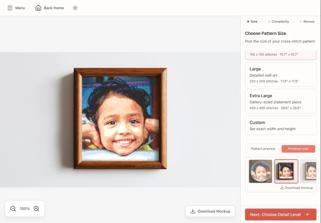
How to Convert a Photo to a Cross Stitch Pattern
Learn which photos convert well, optimal settings, and step-by-step conversion guide.
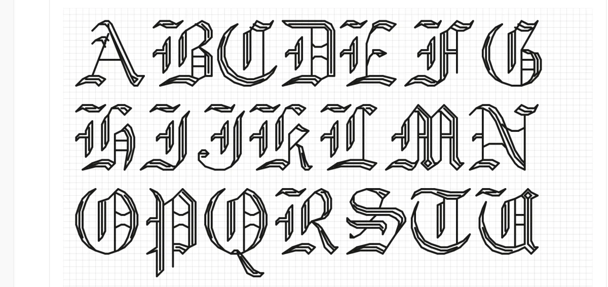
Cross Stitch Fonts & Alphabets
48 built-in fonts for names, quotes, dates, and decorative text in your patterns.
How Many Colors Should a Pattern Have?
Why 4-6 shared colors is the key to a cohesive collage composition.
Best Photos for Cross Stitch
Which photos convert well for use as focal elements in your compositions.
Backstitch in Cross Stitch
Add outlines and detail to your composed elements with backstitching.

What is Aida Count?
Choose the right fabric count for your composition size and detail level.
Data Stitching: Encoding Personal Data in Cross Stitch
Turn weather logs, fitness stats, and life milestones into meaningful stitch art.