Data Stitching: Turn Personal Data into Cross Stitch Patterns
Cross stitch is a data visualization medium — the grid is already there. Temperature, mood, books read, runs logged: any data that changes over time becomes a stitchable pattern.
Quick answer: Data stitching means encoding personal data — temperature, mood, books read, runs logged — into cross stitch patterns where each stitch's color represents a data point. The grid is already there; you just map your data onto it.
A cross stitch pattern is a grid of colored cells. A heatmap is a grid of colored cells. A calendar is a grid of colored cells.
Once you see this, you can't unsee it: cross stitch is a data visualization medium. The grid is already there. The color-coding is already there. The only question is — what data are you encoding?
Temperature blankets cracked this open in the knitting world years ago. One row per day, color determined by the high temperature. A year of weather becomes a blanket you can wrap around yourself. The concept has crossed into cross stitch too — communities like r/CrossStitch regularly share temperature and data-driven designs — but almost nobody has taken it further. The temperature version is just the beginning.
Any data that changes over time and can be mapped to colors becomes a stitchable pattern. Your year in books. Your running log. Your mood. Your baby's first year. Your garden's bloom cycle. Your city's rainfall. The data is personal, the output is beautiful, and the finished piece means something that no purchased pattern ever could.
How data stitching works
The basic framework is simple:
- Choose a data set. Something that changes over time, has a manageable number of categories or a numeric range, and means something to you personally.
- Choose a color mapping. Assign colors to values. Warmer values get warmer colors. Categories get distinct colors. The palette becomes a legend. Browse the DMC color chart to find thread colors that map well to your data ranges.
- Choose a layout. How does the data map onto the grid? One stitch per day? One row per week? A spiral? A calendar grid?
- Stitch it. The data determines every color decision. You're not designing — you're transcribing. The beauty emerges from the data itself.
The result is a piece that's both abstract art and personal record. Viewers who know the color key can read the data. Viewers who don't still see a beautiful pattern of color — clusters, gradients, rhythms that reflect real-world patterns in your life.
Temperature cross stitch: the gateway project
If you're new to data stitching, temperature is the place to start. The data is freely available, updates daily, and produces reliably beautiful color patterns because weather has natural rhythm — warm seasons and cool seasons create visible gradients across the year.
The setup:
- Data source: Any weather site or app that shows daily high temperatures. Weather Underground, the Met Office, or your phone's weather app all work. Record the high temperature for your location each day (or look it up in bulk at the end of each month).
- Color mapping: Divide your local temperature range into 8–14 bands. Each band gets a thread color. A typical mapping for a temperate climate:
| Temperature range | Color suggestion |
|---|---|
| Below 0°C (32°F) | White or ice blue |
| 0–5°C (32–41°F) | Light blue |
| 5–10°C (41–50°F) | Medium blue |
| 10–15°C (50–59°F) | Teal or blue-green |
| 15–20°C (59–68°F) | Green |
| 20–25°C (68–77°F) | Yellow-green |
| 25–30°C (77–86°F) | Yellow or gold |
| 30–35°C (86–95°F) | Orange |
| Above 35°C (95°F) | Red |
Adjust the ranges for your climate. Someone in Tbilisi needs different bands than someone in Edinburgh or Phoenix.
- Layout options:
- Linear strip: One stitch per day, in a single row or column. 365 stitches long — works as a bookmark or a narrow wall piece.
- Calendar grid: 52 columns (weeks) x 7 rows (days). Each cell is one day. The finished piece reads like a calendar with color instead of numbers.
- Spiral: Start from the center and spiral outward, one stitch per day. More complex to chart but visually striking.
- Circular: 12 segments (months) radiating from a center point. Each segment has 28–31 stitches for the days. The finished piece looks like a color wheel of your year.
Why it works: Weather data has built-in structure — seasonal cycles create color gradients that sweep across the piece. You don't need to design anything; the data does the visual work. The resulting piece is uniquely tied to a specific year and location. No two are alike.
Beyond temperature: ten data stitching ideas
1. Reading log
One stitch per day, colored by what you were reading (or whether you read at all).
- Color mapping by genre: Fiction = blue, non-fiction = green, poetry = purple, not reading = gray.
- Or by page count: Light color for under 20 pages, medium for 20–50, dark for 50+.
- Layout: Calendar grid (52x7) works beautifully. You'll see your reading streaks and dry spells as color clusters.
2. Running or cycling log
One stitch per day, colored by distance, pace, or heart rate.
- Color mapping by distance: Rest day = light gray. Short run (under 5 km) = light green. Medium (5–10 km) = green. Long run (10+ km) = dark green. Race day = gold.
- Layout: Calendar grid or linear strip. The taper before a race and the recovery after become visible as color patterns.
- Bonus data layer: Use the width of each day's column to represent distance — wider columns for longer runs. The piece becomes both color-coded and proportional.
3. Mood tracker
One stitch per day, colored by how you felt.
- Color mapping: Use whatever associations feel right to you. Many people use warm colors for good days and cool colors for harder ones, but there's no rule — assign colors that feel honest.
- Layout: Calendar grid. Clusters of similar colors reveal patterns you might not notice in a journal or app. Seasonal mood shifts become visible. So do the effects of life events.
- A note on sensitivity: Mood tracking through craft can be genuinely therapeutic — the act of stitching is calming, and the finished piece gives distance on experiences that felt overwhelming in the moment. But if tracking mood daily feels like pressure, skip days guilt-free. Gaps in the data are data too.
4. Music listening history
Spotify, Apple Music, and Last.fm all track what you listen to. Map it to stitches.
- Color mapping by genre: Rock = red, electronic = blue, jazz = gold, classical = purple, pop = pink. Or map by artist — assign a color to each of your top five most-played artists.
- Layout: One row per week, one stitch per day, colored by whatever you listened to most that day. Or go finer: one stitch per hour, with the color representing whatever was playing. A full year at hourly resolution is 8,760 stitches — about 90x97, a medium-sized pattern.
5. Baby's first year
A record of a child's first 365 days, encoded in thread.
- Color mapping: Milestone categories. Slept through the night = dark blue. First smile = yellow. First food = green. First word = gold. Illness = gray. Travel = orange. Regular day = light blue.
- Or simpler: One color for sleep quality (light = bad night, dark = good night). New parents will see the progression from chaotic newborn sleep to (hopefully) longer stretches of dark color as the months pass.
- Layout: Calendar grid or spiral. Add the baby's name and birth date with the text tool.
6. Garden bloom calendar
One stitch per day per plant, colored by whether it was in bloom, budding, green, or dormant.
- Color mapping: Dormant = brown. Leafing = light green. Budding = yellow-green. In bloom = the actual flower color. Fruiting = orange or red.
- Layout: One column per week, one row per plant species. The finished piece shows your garden's entire growing season at a glance — when things bloomed, how long the blooms lasted, which plants overlapped.
7. Rainfall
Daily rainfall data, available from weather services, mapped to color intensity.
- Color mapping: Dry day = cream or white. Light rain = pale blue. Moderate = medium blue. Heavy = dark blue. Storm = navy or near-black.
- Layout: Calendar grid. This produces patterns that are surprisingly beautiful — rain comes in clusters separated by dry spells, creating organic bands of blue and cream. Monsoon climates produce dramatic color shifts; temperate climates produce gentle gradients.
8. Sunrise and sunset times
The length of daylight, mapped to color.
- Color mapping: Short days (winter) = dark tones. Long days (summer) = light tones. Or use a gradient from dark blue (shortest day) through gold (longest day).
- Layout: Linear strip, one stitch per day. The annual cycle of lengthening and shortening days creates a smooth, wave-like gradient — darkest at the solstice, lightest at midsummer. Equinoxes land at the midpoint of the gradient.
9. Habit tracker
Track any daily habit and stitch whether you did it or not.
- Color mapping: Did the thing = color A. Didn't = color B. Multiple habits? Stack rows. Reading = row 1, exercise = row 2, meditation = row 3, each with its own color pair.
- Layout: Calendar grid. Streaks of habit completion show up as solid blocks of color. Breaks show up as interruptions. The visual record is more motivating than any app — you're literally building a physical representation of your consistency.
10. Travel map
Not a daily tracker but a project-based one: stitch a world map or country outline and fill in locations you've visited.
- Color mapping by year: Each year gets a color. Locations visited in 2024 are blue, 2025 are green, 2026 are gold. The finished piece shows both where you've been and when.
- Layout: Find or create a simple grid-based map (pixel art maps work perfectly for this) and use it as your base. Fill in regions as you visit them.
Designing your data piece
Choosing a color palette
The palette is the most important design decision in data stitching. It needs to do two things: be readable as data (distinct enough that categories are clear) and be beautiful as a textile (harmonious enough to hang on a wall). For guidance on how color choices affect the finished piece, see the color theory guide.
Some approaches:
- Temperature gradient: Cool to warm, for numeric data with a natural range. Blues through greens through yellows through reds. This is intuitive — viewers instinctively read blue as "less" and red as "more."
- Categorical with a shared value range: Distinct hues at similar brightness levels, for category data. Blue, green, gold, rose — different hues, similar lightness. This reads as "different but equal."
- Monochromatic intensity: One hue at different saturations or values, for data where "more" and "less" are the key distinction. Light blue to dark navy for rainfall, for example.
- Personal associations: Colors that mean something to you, regardless of convention. If green makes you think of calm and red makes you think of energy, use that mapping for mood data. The piece is for you.
Keep the palette to 6–12 colors. More than that, and categories become hard to distinguish both in the stitch and in the legend.
Adding context
A grid of colored stitches is beautiful but opaque. Adding context turns it from abstract art into readable data:
- A legend. Stitch a small color key in one corner or along one edge: a block of each color with its meaning in text. Stitchmate's text tool handles the labels.
- Month or week markers. Add thin lines or small symbols at regular intervals — a different-colored stitch at the start of each month, or a backstitch divider between weeks.
- A title and date range. "2026" stitched above the grid, or "London weather, January–December 2026" along the bottom.
- Stamps as markers. Use small stamp motifs to mark special events — a heart for an anniversary, a star for a personal best, a small icon for a birthday. See the collage composition guide for more on combining elements.
Size planning
Most data stitching projects have a natural size determined by the data:
- 365-day project, calendar layout (52x7): 52 stitches wide x 7 stitches tall for the data grid. With a border, legend, and title, plan for roughly 80x40 stitches total. On 14-count Aida, that's about 14.5 x 7.3 cm (5.7 x 2.9 in) — small enough for a desk frame.
- 365-day project, linear strip: 365 stitches in a single row. On 14-count Aida, that's 66 cm (26 in) long — perfect as a bookmark or narrow wall hanging.
- Hourly resolution for a year: 8,760 cells. In a 90x97 grid, that's about 16 x 18 cm (6.4 x 7 in) on 14-count. A substantial but very manageable project.
Use the fabric calculator to work out exact finished sizes for your planned dimensions and fabric count.
The craft of data
There's something genuinely satisfying about encoding your life into stitches. Every data stitching project creates two parallel experiences:
The first is during the year — the ongoing act of recording. Checking the temperature, logging a run, noting a mood, and knowing it'll become a stitch. It adds a small ritual to each day, a moment of noticing and recording.
The second is after the year — the finished piece as a record. The heatwave in July is visible. The reading binge in October shows up. The training block before the marathon is a clear stripe of color. Personal history, encoded in thread, hanging on a wall.
Unlike a spreadsheet or an app, a stitched data piece is warm. It has texture. It took hours of patient work. It's a physical object that can be given as a gift, displayed in a home, or passed on as an heirloom. Your 2026 weather isn't just a CSV file — it's a piece of fabric you made with your hands.
That's the promise of data stitching: personal data, made physical, through the slowest and most deliberate medium available.
Start Your Data Piece
Map your data to colors, set up your grid, and start encoding your year in thread.
Open Pattern EditorFree to use. No account required.
FAQ
Where do I get daily temperature data in bulk?
Can I start mid-year?
What if I miss a day of recording?
How do I make a color legend that is easy to read?
Can I track multiple data sets in one piece?
Is there software that can generate a pattern from a data file?
Related Guides & Tools
How Many Colors Should a Pattern Have?
6-12 colors is ideal for data stitching — enough to distinguish categories, few enough to be manageable.
Color Theory for Cross Stitch
How to choose palettes that work as both readable data and beautiful textiles.
Pixel Art to Cross Stitch
Import data-generated images using pixel art mode — one pixel becomes one stitch.
Collage Composition Guide
Combine your data grid with text, borders, and stamps for a complete composed piece.
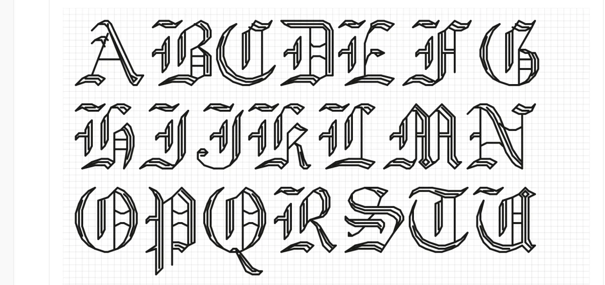
Cross Stitch Fonts & Alphabets
Add legends, titles, and date labels to your data piece with built-in fonts.

What is Aida Count?
How fabric count determines the finished size of your data piece.