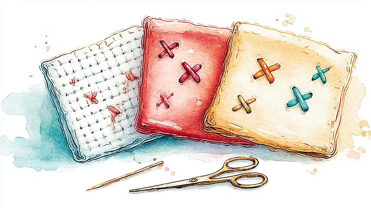
Color Theory for Cross Stitch: What Works on Screen Doesn't Always Work in Thread
Your monitor lies about color. Thread reflects light instead of emitting it — and that changes everything about how palettes behave. Here is how to work with the gap between screen and stitch.
Every color theory guide for embroidery starts with the color wheel. Primary colors, secondary colors, complementary pairs, analogous harmonies. That's all fine — and completely insufficient for cross stitch, because it ignores the thing that makes thread color fundamentally different from screen color.
Your screen emits light. Thread reflects it.
That single difference changes everything about how color behaves, how combinations read, and why the pattern that looked perfect on your monitor can look muddy, flat, or just wrong when you see it stitched on fabric. This guide is about the gap between screen and stitch — and how to work with it instead of against it.
The screen lies (gently)
When you look at a cross stitch pattern on screen, you're seeing colors produced by mixing red, green, and blue light. This is additive color — add all three at maximum intensity and you get white. Your monitor can produce roughly 16.7 million distinct colors this way.
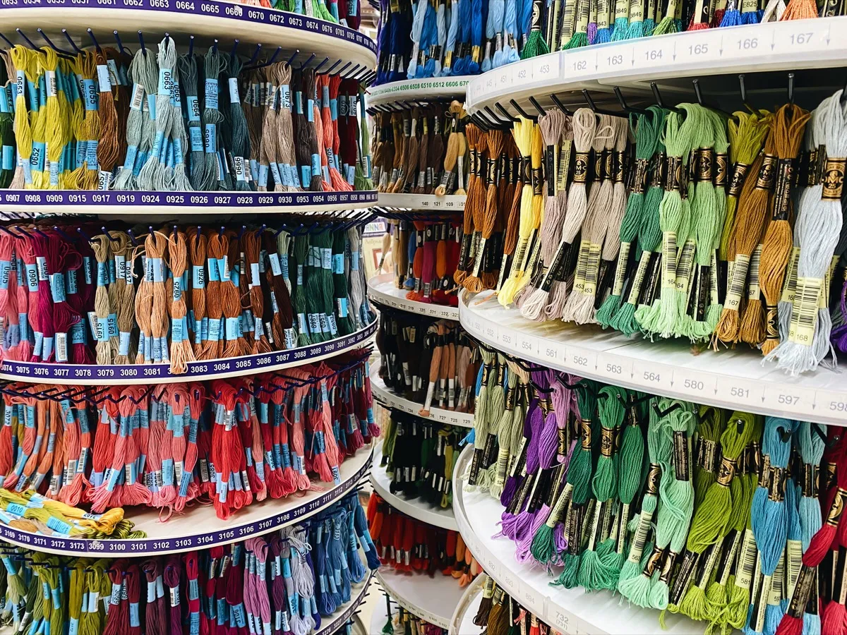
When you look at the same pattern stitched on fabric, you're seeing colors produced by dye absorbing certain wavelengths of light and reflecting the rest. This is subtractive color — closer to mixing paint than mixing light. DMC's range has 489 colors. Anchor has 446. That's the entire palette you're working with.
The mismatch matters in a few specific ways:
Saturated colors lose intensity. The vivid electric blue on your screen is produced by your monitor's blue LEDs at near-maximum output. The closest DMC blue (say, 796) is dyed cotton reflecting ambient light. It will always be less vivid than the screen version. Neon colors, pure cyans, and highly saturated magentas are the biggest casualties — no thread brand can reproduce them faithfully.
Dark colors shift. Very dark colors on screen are produced by reducing light output. On fabric, they're produced by dense, dark dyes that absorb most wavelengths. DMC 310 (black) and 3799 (very dark pewter gray) look clearly different on screen but can be hard to distinguish on fabric in anything less than bright daylight.
Mid-tones are where thread excels. The sweet spot for thread color accuracy is the middle range — not too saturated, not too dark, not too light. Earth tones, muted pastels, warm browns, dusty blues. These colors translate from screen to thread with the least surprise.
Thread is not flat color
Here's something no color wheel diagram captures: thread is a three-dimensional object with texture.
A stitch isn't a flat square of color. It's two crossed bundles of twisted fibers that catch light at different angles. The top leg of the cross typically appears slightly different from the bottom leg because they're oriented differently relative to your light source. The twist of the thread creates tiny highlights and shadows along its length. The fibers have a sheen (mercerized cotton like DMC has a subtle luster; matte cotton looks different; silk is entirely different again).
This means:
Two colors that match on screen can look different on fabric. The thread's physical properties (sheen, twist direction, fiber diameter) affect how light interacts with the dye, and these properties aren't captured by an RGB value.
Thread colors change depending on lighting. The same DMC thread looks different under daylight, warm LED, cool LED, fluorescent, and tungsten light. This isn't a flaw — it's physics. Dyes absorb and reflect different wavelengths depending on the spectrum of the incident light. If you're choosing colors under a warm reading lamp but the finished piece will hang in a room with cool daylight, you may be surprised by the result.
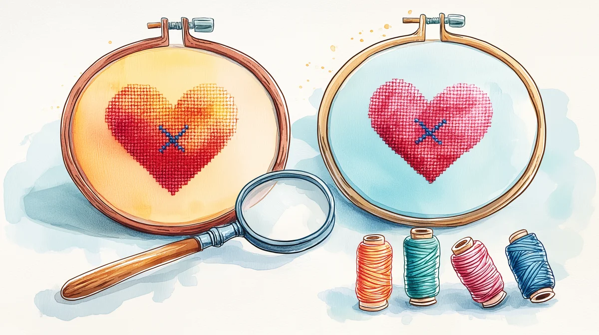
Thread colors change depending on what's next to them. This is simultaneous contrast — a well-documented perceptual phenomenon where a color appears to shift based on the colors surrounding it. A medium gray stitch next to a dark blue stitch looks slightly warm (yellowish). The same gray next to a warm orange looks slightly cool (bluish). The thread hasn't changed; your perception of it has.
Sirithre, a cross stitch designer who works extensively with thread color, puts it plainly: "colors can look quite different when stitched next to each other rather than on the bobbin." Thread is a 3D object that reflects light and the colors around it.
The fabric is your largest color field
The single most overlooked color decision in cross stitch is the fabric. On a typical pattern, the unstitched fabric occupies 0% (full coverage designs) to 70%+ (sparse motifs on open fabric) of the visible area. That makes it the dominant color in most compositions.
And it doesn't just sit there passively. Fabric color actively shifts the perceived color of every thread on it:
White fabric brightens and cools. Colors on white Aida appear slightly cooler and more vivid because the white surround reflects maximum light into your eye.
Cream and natural linen warm everything. The same threads on unbleached linen appear slightly warmer and more muted. Many stitchers prefer this — it gives a softer, more cohesive look.
Black fabric deepens and saturates. Colors on black appear more intense because there's no competing light from the surrounding area. But they also appear darker — light colors can look muddy, and the fabric showing through between stitches darkens everything slightly.
Colored fabric shifts everything. Sage green fabric makes reds appear more vivid (complementary contrast) and makes greens nearly disappear. Blue fabric deepens blues and makes oranges pop. The fabric color is effectively mixed with every thread color via the gaps between stitches.
This gap-mixing is more significant than most stitchers realize. On 14-count Aida with two strands of thread, the stitches don't fully cover the fabric — you can see tiny dots of fabric between the thread bundles. From a distance, your eye blends these together. White dots mixed with blue thread make the blue appear slightly lighter and chalky. Black dots mixed with the same blue make it appear deeper and richer.
When you're choosing thread colors in Stitchmate's editor, you can change the canvas background color to preview this effect. It's worth doing — a palette that works on white may need adjustment for colored fabric.
Value is more important than hue
If there's one thing to take from this guide, it's this: value contrast matters more than color contrast in cross stitch.
Value is the lightness or darkness of a color, independent of its hue. Light pink and dark pink have different values. Light pink and light yellow have similar values.
When two adjacent stitched areas have similar values — even if they're different hues — they blend together when viewed from any distance. A medium blue next to a medium green might look distinct up close, but from across the room (where finished pieces usually live), they merge into one amorphous shape.
The simplest test: take a black-and-white photo of your thread palette on your phone. If two colors that should be distinct look the same in grayscale, they don't have enough value contrast. This works whether you're photographing actual thread or a screen preview — the point is to strip away hue and see only lightness.
Pattern designers use value deliberately to create depth. Lighter values advance (they appear closer to the viewer). Darker values recede. A flower with petals in three values of pink — light, medium, dark — reads as three-dimensional even though every stitch is flat. The same flower in three different hues at the same value reads as flat.
For photo conversions, Stitchmate's color matching algorithm uses perceptual color distance (CIEDE2000) rather than simple RGB distance. This means it weights value differences more heavily than hue differences — because that's how human vision works. Two colors that are mathematically "close" in RGB can be perceptually distinct, and vice versa.
Optical mixing: how blended threads actually work
Blended threads — using two different-colored strands in the same needle — don't create new colors the way paint mixing does. They create the illusion of a new color through optical mixing. From a distance, your eye averages the two colors together. Up close, you see distinct strands of each.
This is the same principle as pointillist painting (Seurat's dots of color) and newspaper halftone printing (tiny dots of CMYK that merge at viewing distance). The "mixed" color exists in your perception, not in the thread.
A few things that affect how blended threads read:
The top leg dominates. In a cross stitch, the top leg of the X sits above the bottom leg. The top leg reflects more light directly toward the viewer. In a blend, whichever color is on top will appear to dominate the perceived mix. This means a blend of dark red + light pink will look different depending on which color crosses on top.
Dark colors overpower light ones. A blend of one strand of black + one strand of white doesn't produce medium gray — it produces a very dark color with occasional flashes of white. Dark dyes absorb more light, making them visually dominant. If you want a balanced blend, use two strands of the lighter color and one of the darker (switching to three strands total).
Blends are viewing-distance dependent. Up close, a blend looks spotty and textured. At arm's length, it starts to merge. From across the room, it reads as a single intermediate color. This is actually an advantage — the piece gains visual complexity that changes with viewing distance, giving it a quality that flat color can't match.
Stitchmate supports blended threads in the editor and lists them in the pattern PDF, so you can design patterns that use optical mixing intentionally rather than as an accident.
Working with limited palettes
A color wheel gives you infinite gradations. Thread gives you ~490 specific colors per brand. This constraint is both the challenge and the creative opportunity of working with thread.
You can't always get the exact color you want. When converting a photo, the algorithm maps every pixel to the nearest available thread color. Sometimes the nearest color is quite close. Sometimes it's noticeably different — especially for colors that fall between two DMC shades with no intermediate option.
Fewer colors often look better. This is counterintuitive, but patterns with 10–20 well-chosen colors frequently look more cohesive and more stitchable than patterns with 40–60 colors that include many near-duplicates. Each additional color adds complexity to the stitching process (more thread changes, more bobbins to manage, more chances for error). If two colors in your palette are so similar that you can't distinguish them at arm's length, merge them.
Build palettes in value steps. A good cross stitch palette covers a range from light to dark, with clear value steps between each color. Three to four values per hue family (light, medium, dark, and optionally very dark) give you enough range to model form and depth. More values than that create subtlety that's lost at viewing distance.
Warm and cool versions of neutrals add depth. Instead of using straight gray for shadows, try warm gray (with a hint of brown or pink) for areas in warm light and cool gray (with a hint of blue or green) for areas in shadow. This is a technique borrowed from painting, and it works beautifully in cross stitch — especially in portraits and landscapes.
Six practical experiments
These are things you can try with thread you already own. No fancy tools needed.
1. The squint test. Hold your threaded bobbins at arm's length and squint until your vision blurs. Colors that merge together don't have enough value contrast for your design. This takes five seconds and prevents hours of regret.
2. The fabric swatch. Stitch the same small motif (a 10x10 square of each color in your palette) on white fabric and on the fabric you're planning to use. Compare them side by side. The colors will shift — sometimes dramatically.
3. The lighting tour. Take your stitched swatch to three different rooms with different lighting. Natural daylight from a window. Warm lamp light. Overhead fluorescent or LED. Notice which color relationships change and which stay stable. The stable ones are your most reliable palette choices.
4. The black-and-white photo. Photograph your palette (either bobbins or a stitched swatch) with your phone, then convert to grayscale using any photo editor. If two distinct colors look the same in grayscale, they'll read as the same value on fabric. Either increase the contrast between them or accept that they'll blend.
5. The viewing-distance walk. Stitch a small sample and prop it up. Look at it from 30 cm (1 foot). Then from 1 meter (3 feet). Then from across the room. Notice what merges, what separates, and what pops. The across-the-room view is the most honest one — it's how your finished piece will usually be seen.
6. The blend experiment. Thread your needle with one strand each of two colors that are 3–4 shades apart on the DMC chart. Stitch a small block. Then stitch the same block with the same colors but the top leg reversed. Compare. The difference is often surprising — and it teaches you more about optical mixing than any amount of reading.
How Stitchmate handles color
A few technical details that connect to everything above:
Perceptual color distance. When Stitchmate matches image pixels to thread colors, it uses CIEDE2000 — a color distance formula designed to match human perception. This means two colors that look similar to your eye are treated as similar by the algorithm, even if their RGB values are far apart mathematically. Simple RGB distance treats all color dimensions equally; CIEDE2000 weights them the way your visual system does.
Target-aware quantization. Most converters reduce colors first, then map the reduced palette to thread. Stitchmate's target-aware mode considers the actual thread palette during reduction — so it never picks an intermediate color that doesn't have a close thread match. This produces fewer unpleasant surprises when you compare screen to stitch.
Background color preview. You can change the canvas background in the editor to approximate different fabric colors. Use this to check whether your palette works on your intended fabric before you buy thread and cut fabric.
50+ thread brands. Different brands have different color ranges. DMC's reds are legendary. Cosmo's subtle earth tones fill gaps that DMC doesn't cover. Anchor's range overlaps DMC but isn't identical — some Anchor blues are slightly warmer, some greens slightly cooler. Try different brands if the closest match in your default brand isn't close enough. The DMC color chart lets you browse the full range, or see the thread types guide for brand comparisons.
FAQ
Why does my photo conversion look different on fabric than on screen?
Should I buy a physical DMC color card?
How many colors should my pattern have?
Can I use colors from different thread brands in the same project?
What is the best lighting for choosing thread colors?
Why do purples cause so many problems in cross stitch?
Try Your Palette
Experiment with thread colors, fabric backgrounds, and blended threads in the pattern editor.
Open Pattern MakerFree to use. No account required.
Related Guides & Tools
How Many Colors Should a Pattern Have?
Why 15–30 colors is usually the sweet spot, and how to avoid the dreaded confetti problem.
How to Convert a Photo to a Cross Stitch Pattern
Step-by-step guide with optimal settings for color accuracy in photo conversions.
DMC vs Anchor Thread
How color ranges differ between the two biggest thread brands — plus conversion tips.
Cross Stitch Thread Types
Stranded cotton, hand-dyed, metallic, silk — how fiber type affects color and sheen.
Cross Stitch Fabric Types
Aida, evenweave, and linen — how fabric choice affects how thread colors appear.

DMC Color Chart
Browse all 489 DMC floss colors with codes, names, and Anchor equivalents.
Data Stitching: Encoding Personal Data in Cross Stitch
Apply color theory deliberately — map real-world data to thread palettes.