How to Blend Threads in Cross Stitch — Complete Guide
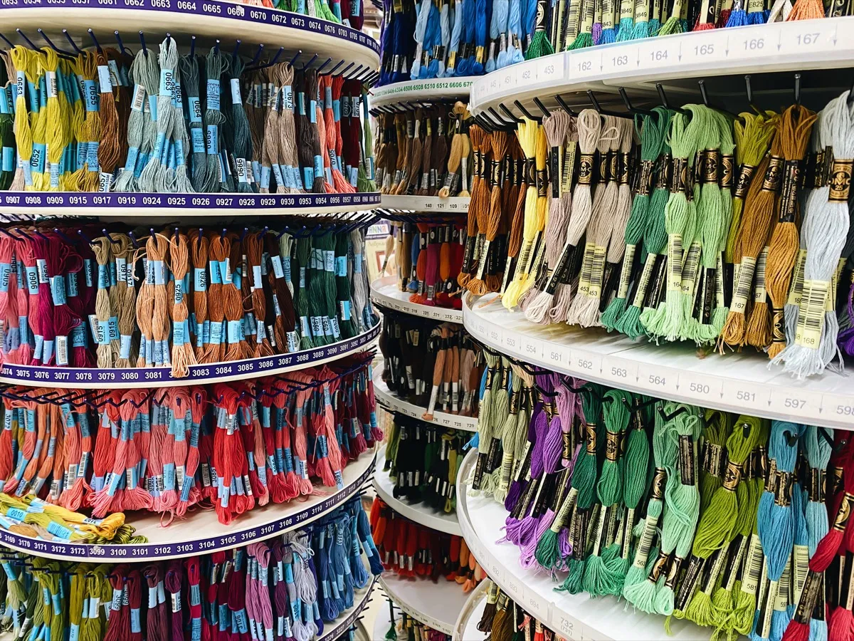
DMC makes 489 colors, but sometimes the perfect shade doesn't exist. Thread blending lets you create it — by combining two colors on one needle for custom, optically mixed tones.
Quick answer: Thread blending means combining two different thread colors on one needle — typically one strand of each — to create a custom shade that doesn't exist as a single thread. It's the cross stitch equivalent of mixing paint.
DMCmakes 489 colors.
Anchormakes nearly as many. And yet you'll still run into moments where none of them are quite right — the shade between two blues doesn't exist, the skin tone needs more warmth, the shadow could be just a touch darker than anything on the color card.
That's where blended threads come in. Instead of searching for a color that doesn't exist, you create it — by threading two different colors onto the same needle and stitching them together. The result is a new, optically mixed shade that sits between the two parent colors, visible from normal viewing distance as a single coherent tone.
It's one of the oldest techniques in cross stitch, and one of the most powerful tools for adding depth and realism to your work. Teresa Wentzler built an entire design career on it. Scarlet Quince patterns routinely use 100+ blends. Heaven and Earth Designs (HAED) patterns lean heavily on blending for photorealistic shading.
And despite its reputation, the actual stitching is remarkably simple. If you can thread a needle and make a cross stitch, you can blend.
What blended threads actually are
Blending — sometimes called tweeding — means combining strands from two different thread colors on the same needle. On 14-count Aida, where you'd normally stitch with two strands, a blend uses one strand of each color. The two strands twist together as you stitch, creating a heathered, optically mixed appearance.
From a few inches away, your eye merges the two colors into one. Up close, you can see the individual strands — a bit like pointillism in painting, or the CMYK dots in a printed magazine.
On a cross stitch chart, blended stitches get their own unique symbol, different from either parent color used alone. The key lists both thread numbers side by side — something like "1 strand DMC 930 + 1 strand DMC 926."
Why not just use a third color?
Sometimes you can. But blending solves problems a single thread can't:
- The shade doesn't exist. DMC's range has natural gaps — particularly in muted earth tones, certain greens, and the transition zones between color families. A blend of DMC 3371 (black brown) and DMC 938 (ultra dark coffee brown) produces a shade darker than either, with more warmth than plain black.
- You need a transition color. When two adjacent areas use colors that jump in value or hue, a blend creates a smooth bridge. Three rows of blend between a light blue and a medium blue prevents the hard edge that would make your sky look banded.
- You want texture, not flatness. A solid color looks uniform. A blend has visual movement — the two strands catch light differently, creating a subtle depth that reads as more lifelike, especially in hair, fur, and foliage.
Five ways to use blends in your patterns
1. Shade bridging
The most common use. You have two colors that are close but not close enough, and you need a step between them.
Example: transitioning from DMC 3325 (light baby blue) to DMC 334 (medium baby blue). Stitched side by side, the jump is noticeable. Add a row or two of 3325 + 334 blend between them, and the gradient becomes seamless.
Good blend pairs for bridging: colors that are adjacent on the DMC shade card, typically one or two numbers apart in the same family. DMC organizes its numbering loosely by color family, so neighbors tend to blend well.
2. Warming or cooling a color
Sometimes a color is the right value (lightness/darkness) but the wrong temperature. Rather than substituting a completely different color, blend it with a warm or cool modifier.
- To warm a blue: blend with a touch of gray-green or cream (e.g., DMC 3756 + DMC 3866)
- To cool a red: blend with a hint of gray or muted purple
- To mute a bright color: blend with a neutral — ecru, light beige, or pale gray
This is particularly useful in portrait work, where skin tones often need micro-adjustments that don't exist as single threads.
3. Creating depth in large areas
Backgrounds, skies, water, and large blocks of foliage can look lifeless when stitched in a single solid color. Blending two very similar colors adds subtle movement without creating an obvious pattern.
Try DMC 3768 + DMC 924 for a deep teal water, or DMC 3787 + DMC 3790 for a muted gray-brown stone wall. The difference from a solid color is barely perceptible stitch-by-stitch, but across a large area it adds a quality that experienced stitchers notice — the work looks hand-crafted rather than machine-flat.
4. Adding sparkle and texture
Blend one strand of standard stranded cotton with one strand of metallic or blending filament. This is how most patterns add sparkle to snow, water, stars, or jewelry without making the entire area metallic (which would look overwhelming and be miserable to stitch).
Practical note: metallic threads are famously difficult to work with. They fray, they tangle, and they don't behave like cotton. When blending metallics, use shorter lengths — 12 inches maximum — and expect slower progress. Thread conditioner helps, but won't eliminate the frustration entirely. The results are worth it. For more on metallic and specialty threads, see the thread types guide.
5. Variegated effect without variegated thread
Blend one strand of a solid color with one strand of an overdyed or hand-dyed thread (Weeks Dye Works, Classic Colorworks, or DMC Color Variations). The solid strand anchors the overall color, while the variegated strand adds subtle color shifts. The result is more controlled than using two strands of variegated thread, which can sometimes look chaotic.
How to stitch blended threads
The mechanics are simple — the skill is in keeping things tidy.
The basic method
- Cut one strand of each color, same length. 15–18 inches works well; go shorter (12 inches) if either thread is metallic or hand-dyed.
- Thread both strands through the needle together. A needle threader helps. Some stitchers prefer a double-eye needle, which has two eyes — one for each strand — keeping them separated.
- Stitch normally. Make your crosses exactly as you would with two strands of the same color. The strands will naturally twist and interleave.
- Keep consistent tension. This matters more with blends than with solid colors. Too tight and one strand can pull ahead; too loose and the strands separate visibly.
The loop start problem
If you normally start with the loop method (folding one strand in half, threading both ends through the needle, and anchoring through the fold), you can't use it for blends — folding one strand gives you two of the same color, defeating the purpose.
Options for starting blended threads:
- Waste knot: tie a small knot at the tail end, start 1–2 inches from your first stitch, and trim the knot later once the tail is secured under stitches
- Pin stitch: anchor a single tiny stitch in a corner of your first cross
- Tuck under: leave a 1-inch tail on the back and catch it under your first several stitches
Most stitchers who work with blends regularly settle on waste knots. They're fast and reliable.
Railroading for neater blends
Railroading means sliding your needle between the two strands before pulling each stitch tight, so the strands lie side by side rather than twisting together. This produces a smoother, more uniform appearance.
Is it necessary? No. From normal viewing distance (arm's length or more), railroaded and non-railroaded blends look very similar. But if the two colors are very different — say a light cream and a dark brown — railroading prevents one color from visually dominating.
If railroading sounds fiddly and slow, that's because it is, at first. Most stitchers find it becomes automatic after 50–100 stitches.
Which color goes on top?
Here's a subtlety that most guides skip. When you stitch a blend, the strand that forms the top leg of the cross will be slightly more visible. This means:
- Lighter color on top = the blend reads slightly lighter overall
- Darker color on top = the blend reads slightly darker
The difference is subtle but real. Whatever you choose, be consistent throughout the project — switching randomly creates visible inconsistency.
Some designers specify which color should be on top. If your pattern doesn't, lighter on top is a safe default for most subjects.
The layered blend technique
An alternative to threading both colors on the same needle: stitch the bottom legs of your crosses in one color, then stitch the top legs in the other color. You're building the blend in layers rather than mixing on the needle.
This produces a slightly more uniform result — each color sits cleanly in its own layer rather than twisting around the other. It's slower (you're making two passes instead of one) and uses more thread, but for small areas with high visibility — faces, eyes, focal points — it can be worth the extra effort.
Choosing blend combinations that work
Not every pair of colors blends well. Here's what to consider:
Value matters more than hue
Two colors of similar value (lightness/darkness) will blend smoothly. Two colors of very different values will create a busy, dithered appearance that may not read as a single tone from distance.
Before committing to a blend, squint at the two threads held together. If they merge into one tone, the blend will work. If you can still clearly distinguish them, the result might look more like confetti than a smooth blend.
Stay in the same temperature family
Cool colors blend well with other cool colors. Warm with warm. Mixing temperatures — say a warm red with a cool blue — tends to produce muddy, brownish results. This is the same principle as paint mixing, because the optical blending works similarly.
If you need to bridge between a warm and cool area, use a neutral (gray, ecru, or taupe) as one of the blend partners.
Test before committing
Stitch a small sample — even 3x3 stitches is enough to see how a blend reads. Use the same fabric you'll use for the final project, since fabric color affects how threads look. A blend that looks perfect on white Aida might disappear on cream linen.
This three-minute test saves hours of frogging later.
Blended threads in pattern design
If you're designing patterns rather than stitching from someone else's chart, blends open up significant creative possibilities — but they add complexity to both design and documentation.
When to use blends in your designs
- Photorealistic portraits and pet patterns: where smooth gradients are essential and color accuracy matters — especially when converting photos to patterns
- Nature scenes: landscapes, flowers, and animal fur benefit enormously from the texture blends create
- Large full-coverage pieces: where flat solid colors would look monotonous across hundreds of stitches
- Whenever the thread range has a gap: when the perfect shade simply doesn't exist as a single color
When to avoid blends
- Simple, graphic patterns: clean color blocks look better without the visual noise of blending
- Patterns intended for beginners: blends add complexity to kitting, organization, and stitching
- Patterns with very high color counts already: adding blends on top of 80+ solid colors creates organizational nightmares for stitchers
The tradeoff to acknowledge
Every blend you add to a pattern increases complexity for the stitcher. More blends means more thread combinations to manage, more needle changes, more organization overhead, and more chance of mistakes. A pattern with 15 solid colors and 30 blends requires the stitcher to manage 45 color entries — and the blends are harder to distinguish at a glance than solids.
The best designers use blends where they genuinely improve the result, not as a substitute for careful color selection. If you can achieve a similar effect with a solid color, the solid is usually the better choice.
How Stitchmate handles blended threads
Stitchmate treats blended threads as first-class palette entries. You can create a blend by selecting two threads from any supported brand — the palette shows both thread numbers side by side, and the color swatch displays a mixed preview so you can see how the blend reads on screen.
In the editor, blended stitches render with both colors visible, giving you a realistic sense of how the finished piece will look. When you export to PDF, the thread key lists both component colors with clear notation — "1x DMC 930 + 1x DMC 926" — so stitchers know exactly what to put on their needle.
This works across all 40+ supported thread brands. You can blend DMC with DMC, Anchor with Anchor, or even mix brands if that's what your design needs (though mixing brands is less common, since thread weights vary slightly between manufacturers).
For pattern designers, the thread usage estimation accounts for blends correctly — each component color's usage is calculated separately, because that's how stitchers buy thread.
Organizing blended threads while stitching
The biggest practical challenge with blends isn't the stitching itself — it's keeping 20+ blend combinations straight across a large project.
Labeling system
Label each blend combination clearly. Many stitchers use small adhesive labels or custom floss drops with both thread numbers written on them. "930 + 926" is clearer than trying to remember which shade of blue-green you mixed.
Pre-cut and pair
Before each stitching session, cut your strands and pair them. Having blended pairs ready to go means you're not hunting for matching threads mid-stitch.
Thread organizers
For blend-heavy projects (anything with 10+ blends), a dedicated thread organizer is worth the investment. Some stitchers use small zip-lock bags, one per blend, labeled with the thread numbers and the chart symbol. Others use thread cards with the blend strands wound together.
Digital tracking
If you use Pattern Keeper or a similar app, your blends appear as distinct entries in the thread list — tap the blend symbol, and both component colors are shown. This makes it much easier to manage blend-heavy patterns than working from a paper chart alone.
Common mistakes to avoid
Using the same symbol for a blend and a solid. If your pattern uses DMC 930 as both a solid color and as part of a blend, make sure the blend has its own distinct symbol. Stitchers should never have to guess whether a square means "two strands of 930" or "one strand of 930 + one strand of 926."
Blending colors that are too far apart in value. A light cream blended with a dark navy won't read as a medium blue-gray from distance — it'll look like confetti. Keep blends within two or three value steps of each other.
Over-blending a pattern. It's tempting to add blends everywhere once you discover the technique. Resist. A pattern with 80 blends is a project management headache, not a sign of sophistication. The most effective blend use is surgical — five to ten well-chosen blends in a 30-color pattern can transform the result.
Inconsistent top-leg color. Pick one color to go on top and stick with it throughout. Random switching creates visible inconsistency, especially in large blended areas.
Forgetting to test. Thread colors on a screen never perfectly match the actual thread. A blend that looks ideal in your pattern software may read differently once stitched. Sample first, especially for blends in focal areas like faces or eyes.
Try Blending in Stitchmate
Create blended palette entries and preview how they look in real time — before cutting any thread.
Open Pattern EditorFree to use. No account required.
FAQ
How many strands do I use for blended threads?
Can I blend more than two colors?
Do blends use more thread than solid colors?
Can I use the loop start with blended threads?
What if my pattern does not specify which color goes on top?
What is thread blending in cross stitch?
How do blends appear in Pattern Keeper?
Related Guides & Tools
Cross Stitch Thread Types
Stranded cotton, hand-dyed, metallic, silk, and more — which thread for which project.
DMC vs Anchor Thread
Compare embroidery floss brands — color range, feel, availability, and price.
How Many Colors Should a Pattern Have?
Why 15-30 colors is usually the sweet spot, and how to avoid the dreaded confetti problem.
What Is Confetti in Cross Stitch?
Understanding scattered single stitches and how to manage them in your patterns.

What is Aida Count?
14-count = 14 stitches per inch. How count affects thread strands and blending.
Cross Stitch Fabric Types
Aida, evenweave, linen, and specialty fabrics — each affects how blends look.
Color Theory for Cross Stitch
Why optical mixing works, how value contrast matters more than hue, and the science behind blend choices.